

The Question
Every great design starts with a question. For the AOS logo, we asked ourselves: how can we create something new that still feels like a natural part of ACA’s brand? We wanted to balance familiarity with a standout identity. We knew it had to fit seamlessly within our visual ecosystem while clearly marking AOS as the premier loan origination service. This was the foundation for everything that followed.
Symbolic vs Literal
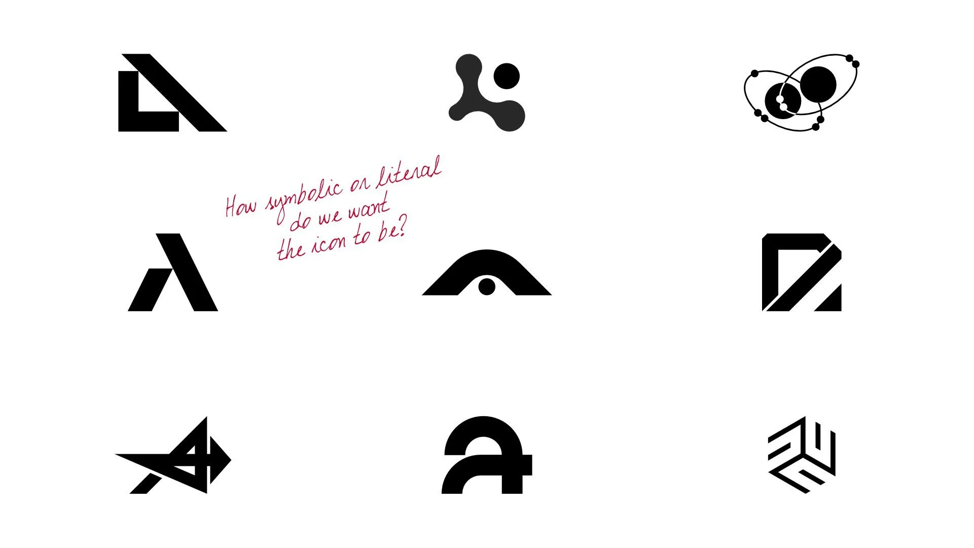
We wrestled with how far to push the design. Should the icon symbolize the broader purpose of AOS, or take a literal approach tied to its name? Each option brought unique strengths, but the challenge was finding a balance that felt both meaningful and instantly recognizable. Through exploration, we refined our focus, ensuring the icon would resonate within the ACA brand while standing on its own. It was a process of distilling complexity into something simple yet impactful.

Hyperliteral Wins
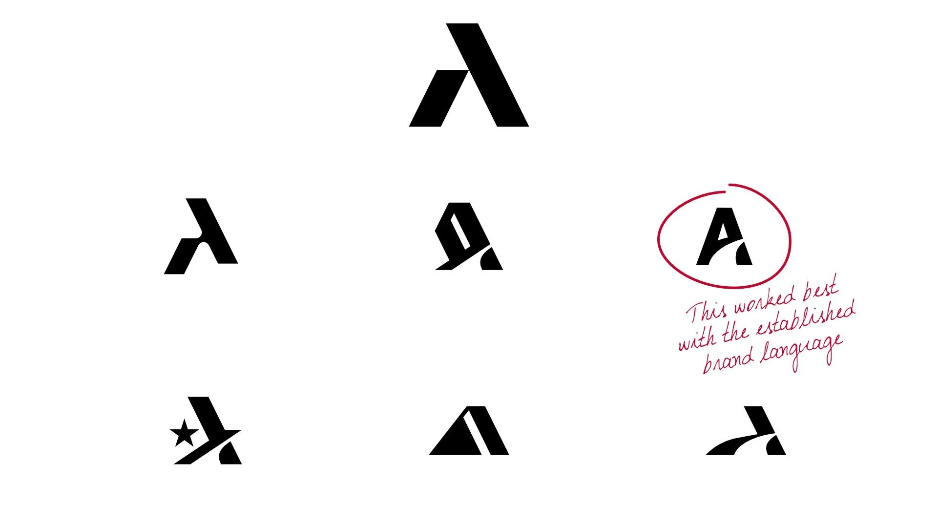
We landed on the minimalist "A," made up of two leaning pillars supporting each other. This design symbolizes the relationship between the application and the business, each holding the other up. The shape naturally forms an "A," tying it directly to AOS while keeping the concept clean and meaningful. It’s simple yet powerful, embodying both collaboration and stability in a single mark. We used this concept for the next phase of iteration.
A Symbol of Motion
In this phase, we refined the concept, pushing the design toward motion and flow. The selected icon features an "A" with a curved path cutting through, creating a sense of direction and progress. This curve symbolizes a road, guiding the viewer’s eye naturally from left to right. It ties perfectly into the established brand language while reinforcing the purpose of AOS as a forward-moving, supportive tool. The result feels dynamic yet grounded in the simplicity we aimed for.
The Visual Equation
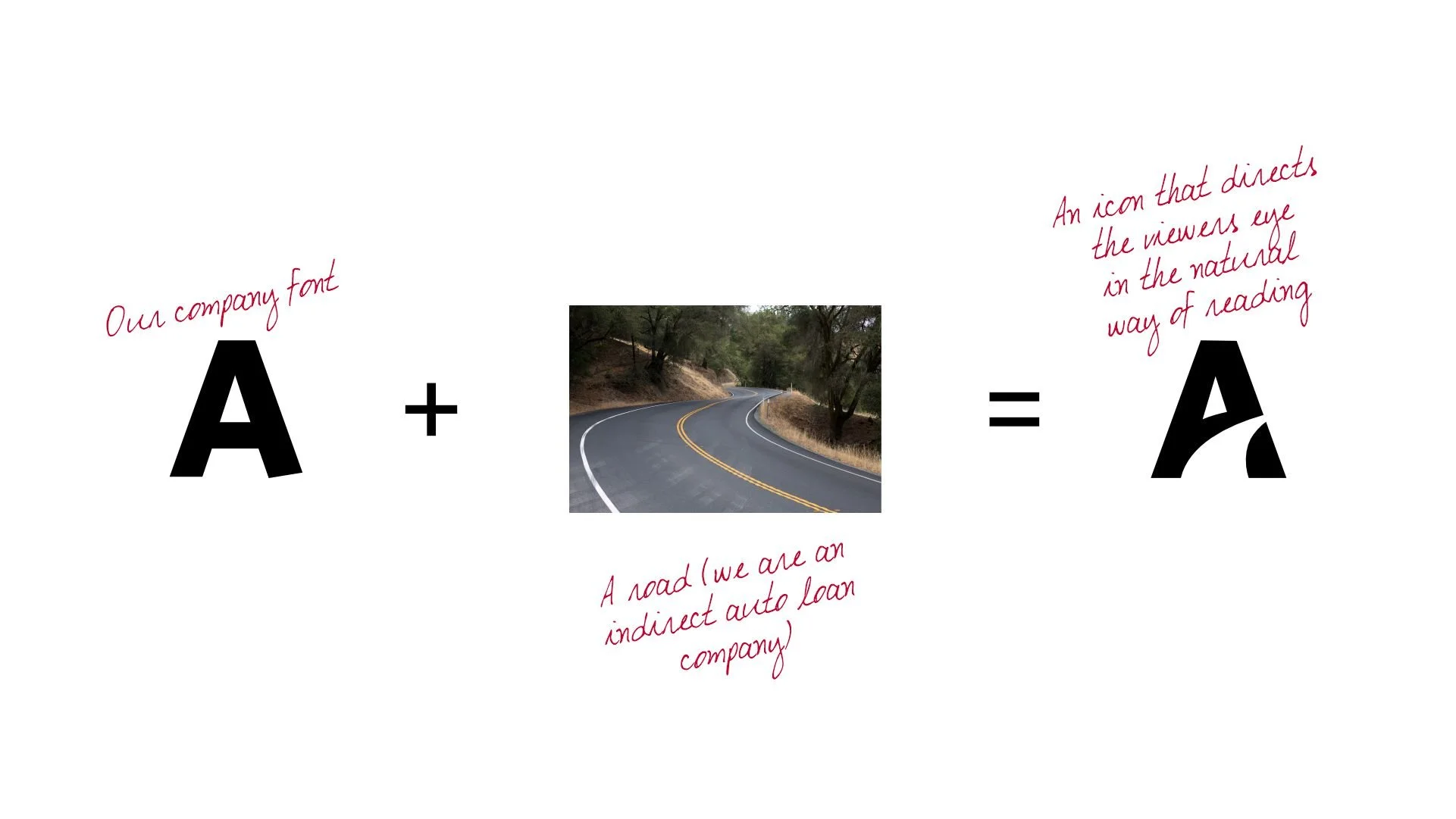
Our defining moment over the course of designing this icon was asking ourselves the following question, "Instead of trying to materialize abstract ideas that are outside of our current brands visual language, what if we deconstruct or reverse-engineer our current brand identity to keep this rooted in a design language that everyone is familiar with?".
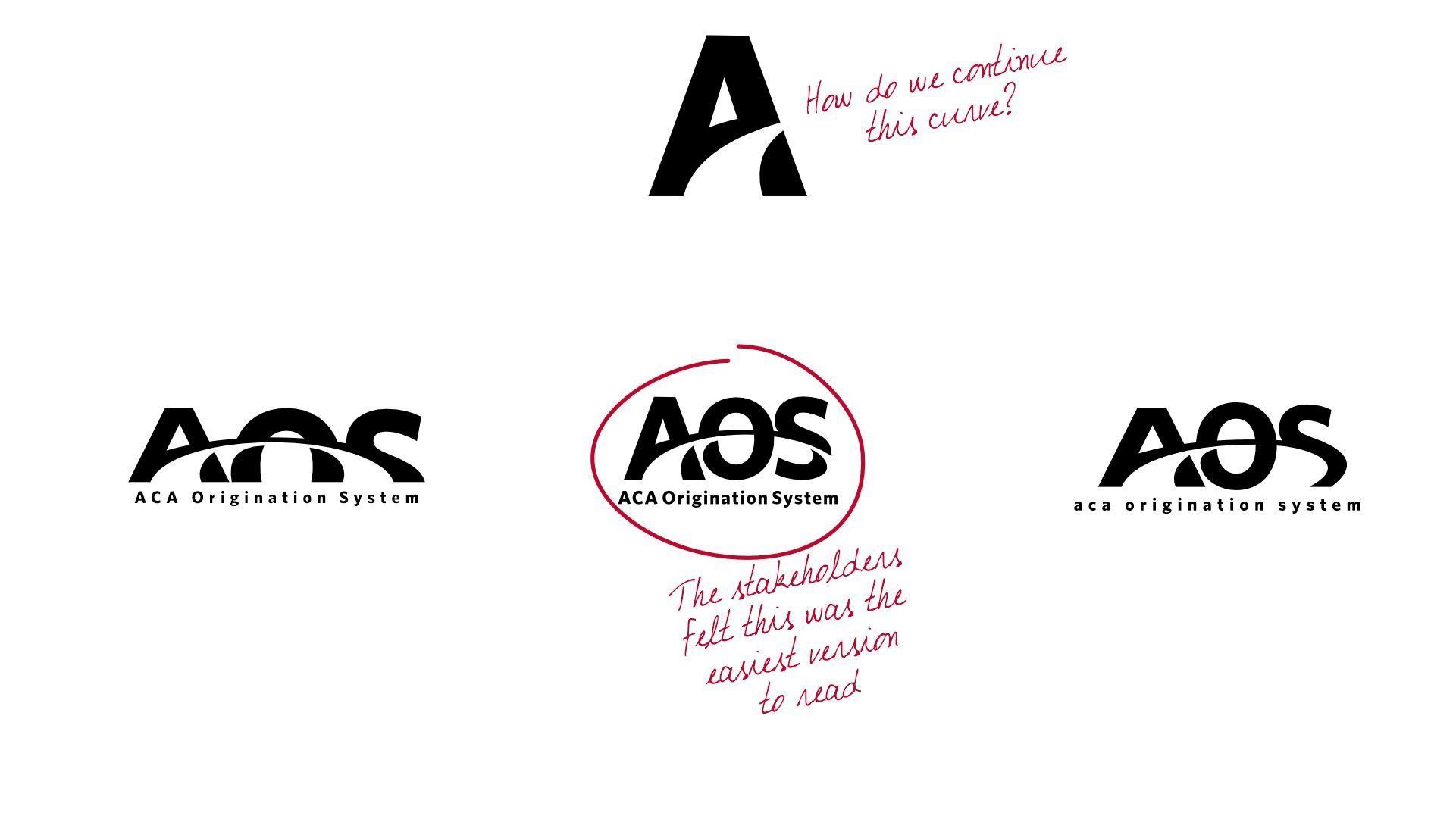
What's Next?
With the icon finalized, the next challenge was creating a full logo that expanded on its design. We focused on extending the curve from the "A" through the "O" and "S," creating a seamless flow. The stakeholders gravitated toward this version for its clarity and readability, with "ACA Origination Service" tying everything together. It brought cohesion to the logo while maintaining the simplicity and motion we aimed for. This iteration became the foundation for the final design.

Let's Get Colorful!
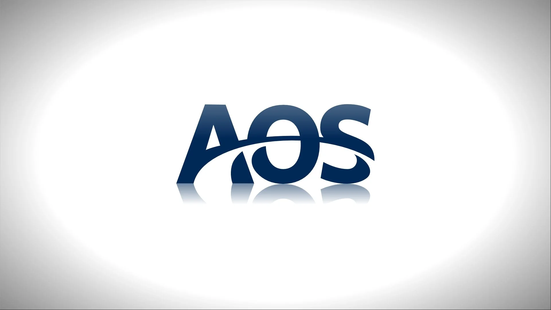
With the design locked in, we explored color to bring the logo to life. We tested red, a red-to-blue gradient, and solid blue, aiming for a look that felt bold yet professional. In the end, solid blue won. It aligned best with our brand and conveyed trust and stability. The team agreed this choice worked seamlessly with both the icon and the full logo. It was the final touch to complete the design.
Practicality
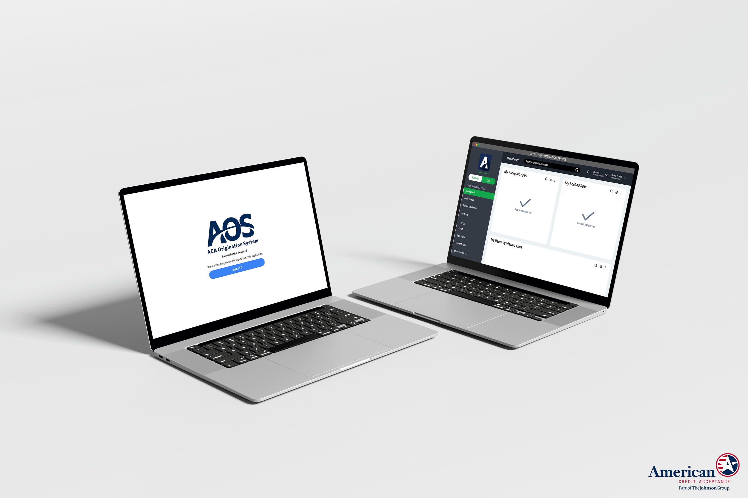
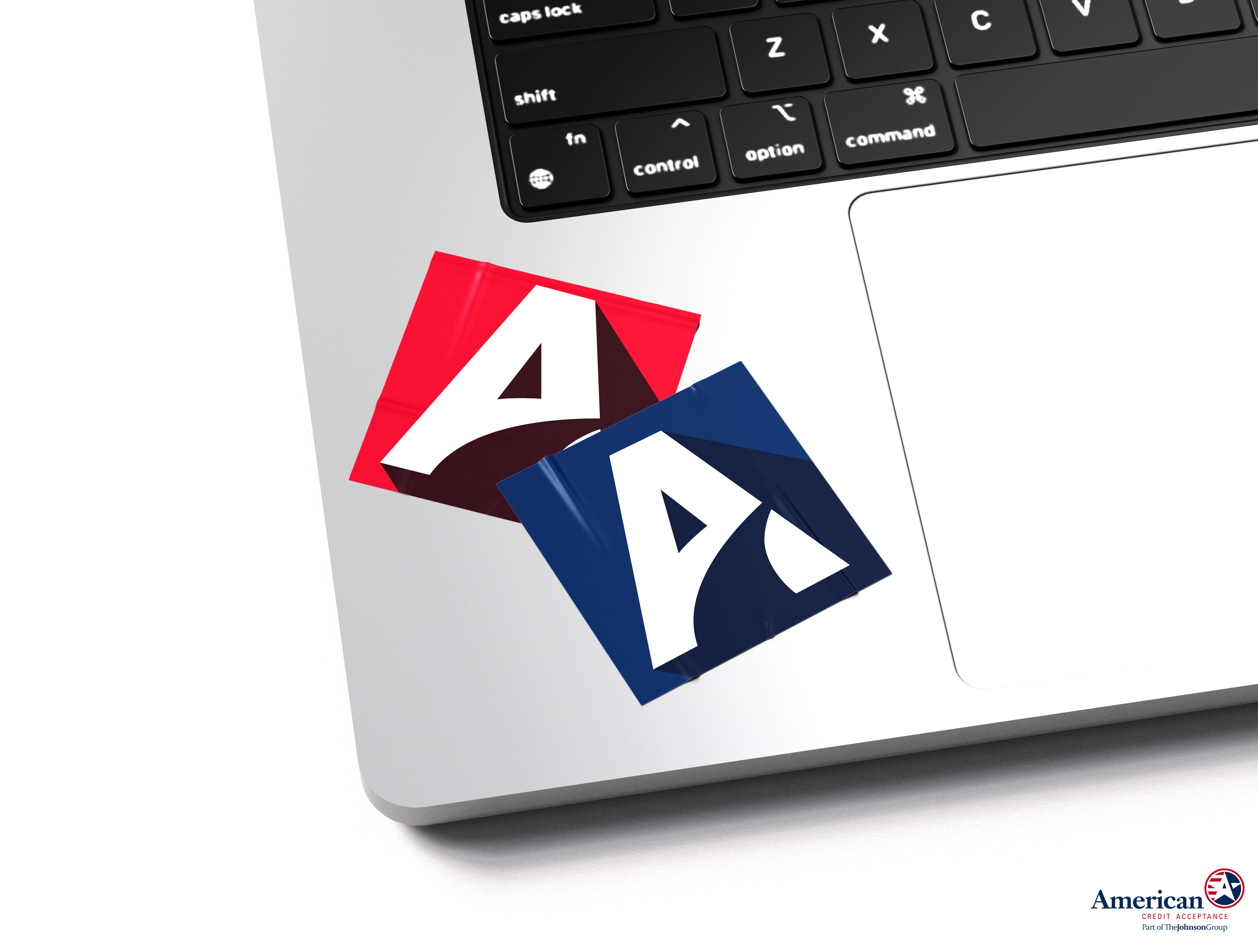
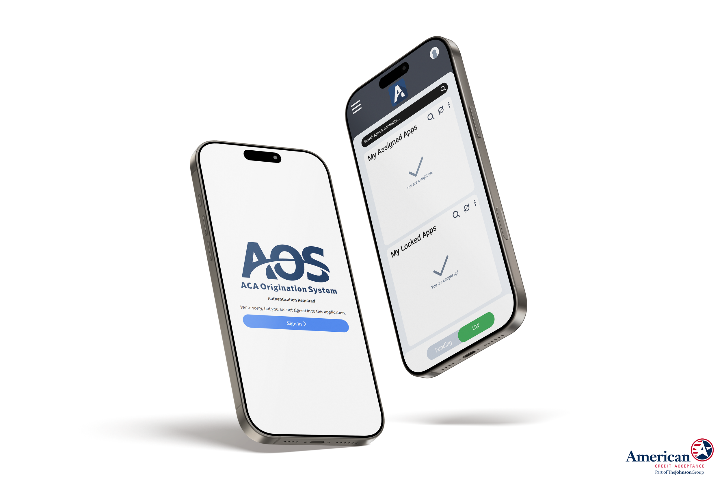
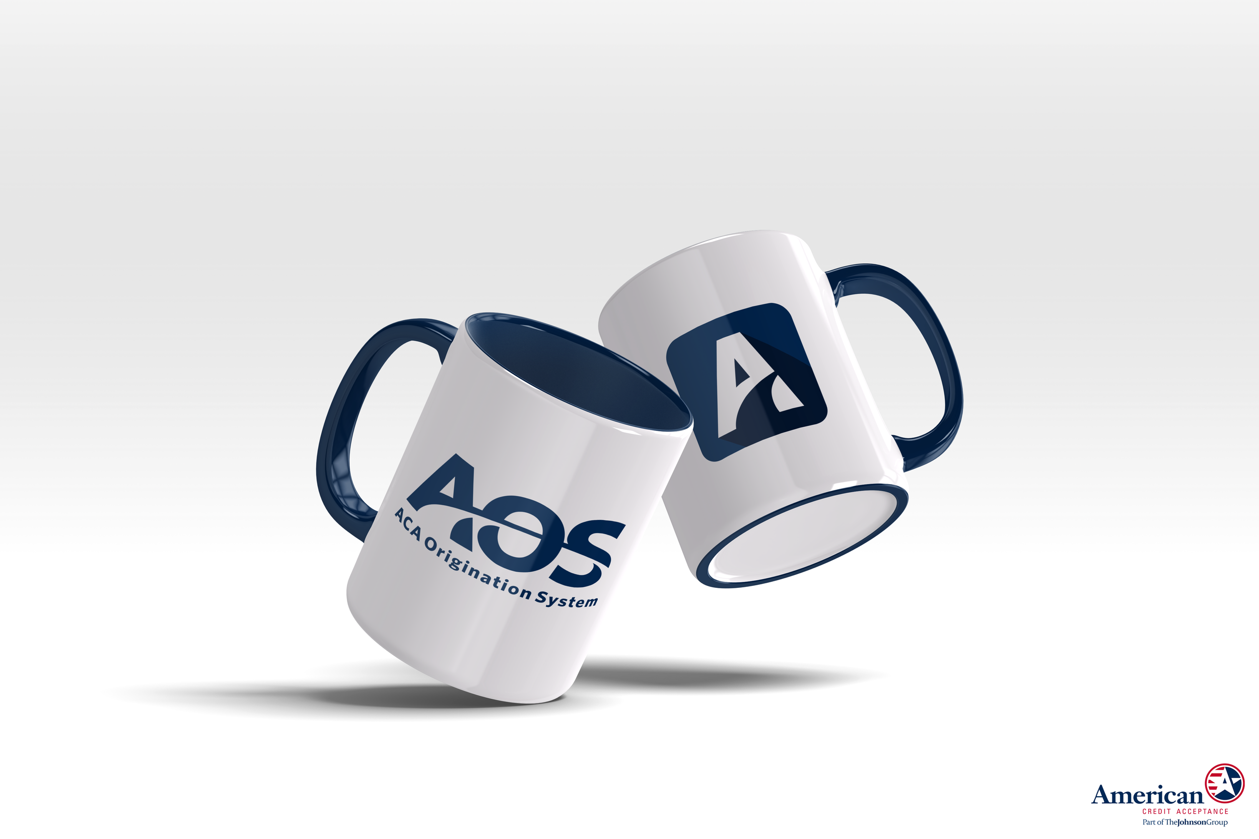
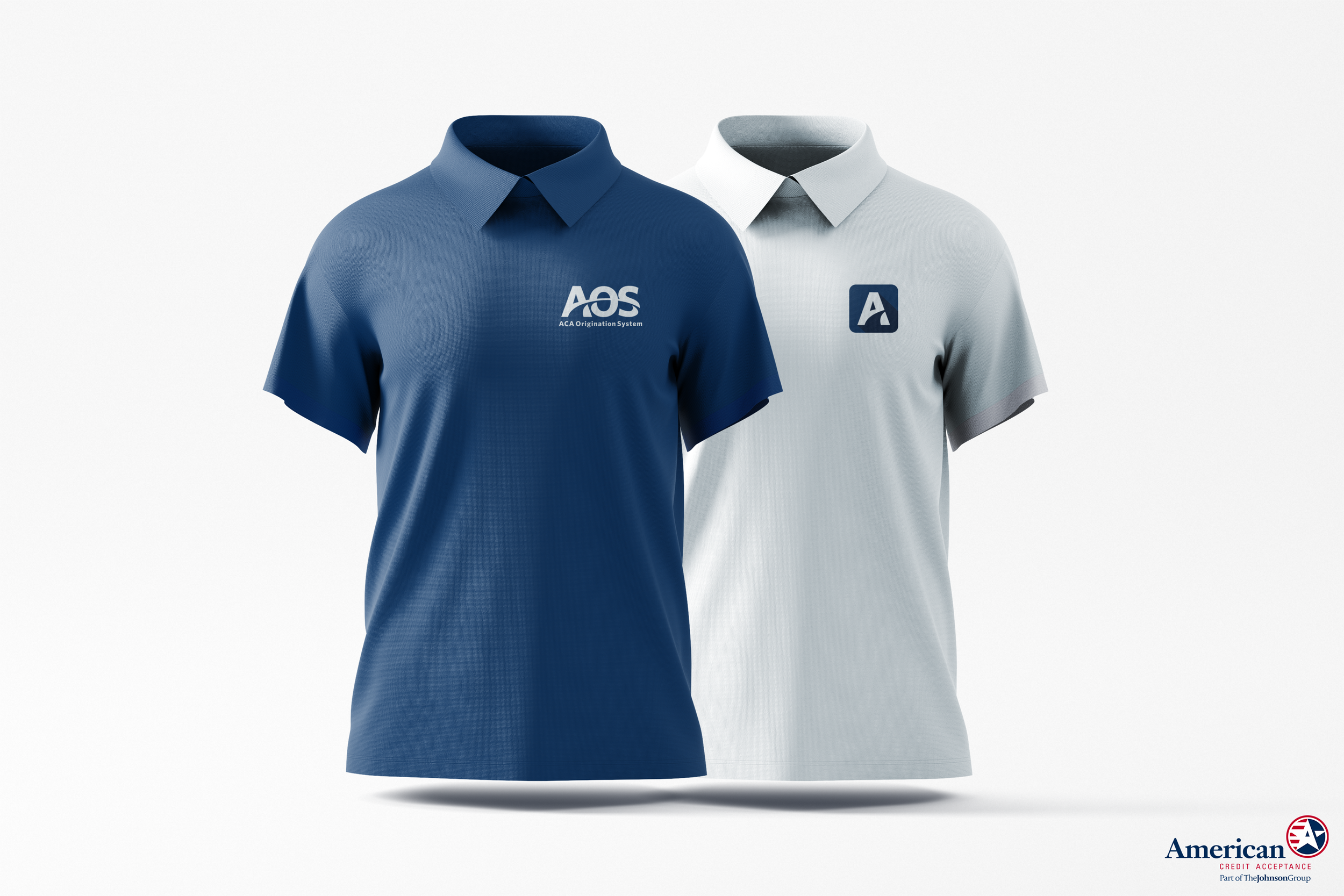
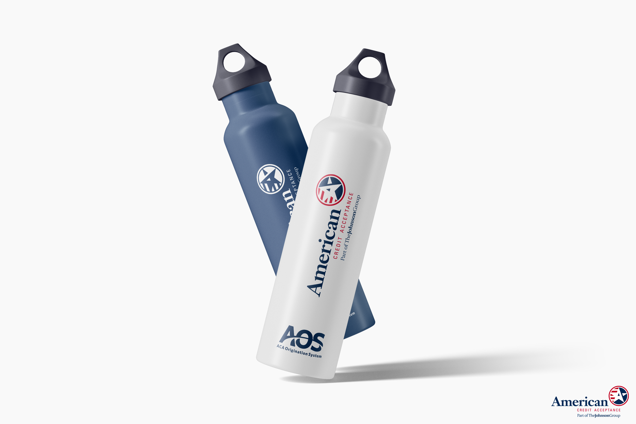
We tested the icon in real-world scenarios to ensure it was both functional and recognizable. Mockups of stickers, embroidered polos, and the login screen helped us confirm its versatility across digital and physical formats. These practical tests reinforced that the design wasn’t just visually appealing, it was ready to perform wherever needed.

Make It Move!
We animated the logo to create a sense of anticipation and flow, mirroring the connectivity and movement central to the LOS. The fading and sweeping motion emphasize the seamless integration of the system’s features, reinforcing its role as a unifying tool for the business. This approach also makes the introduction more engaging and memorable, leaving a strong impression on both internal teams and external audiences. It was designed to visually communicate the system's purpose: connection, progress, and support.