

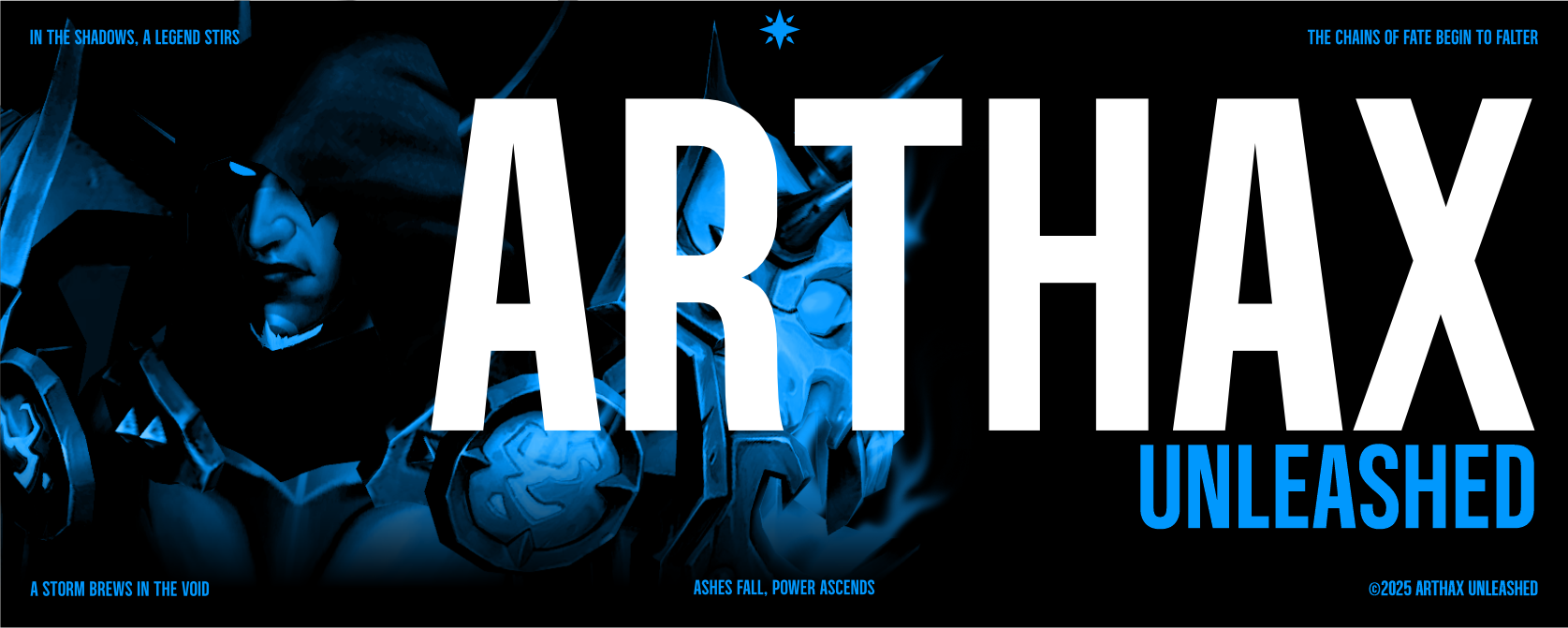
Finding the Voice
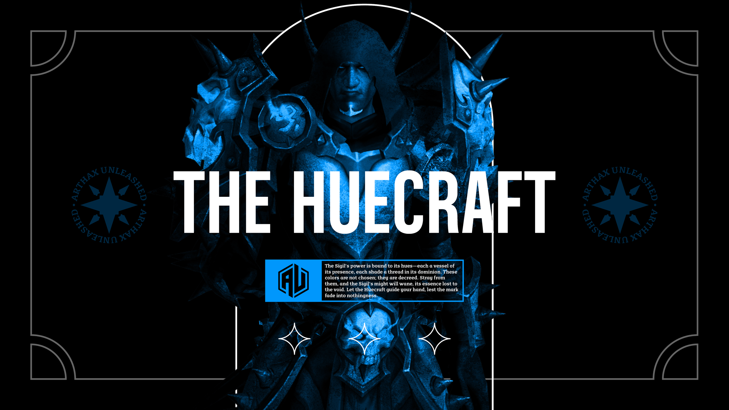
Arthax wanted a fresh voice for the channel, something that felt more exciting and connected to the RPGs he loves. The original style didn’t quite fit, so we leaned into something darker, more mysterious, a tone that could match the worlds of magic, adventure, and danger his audience knows well. Dark fantasy felt right. Bold, intriguing, and full of depth. It gave the brand room to grow, with visuals and language that feel powerful and immersive.

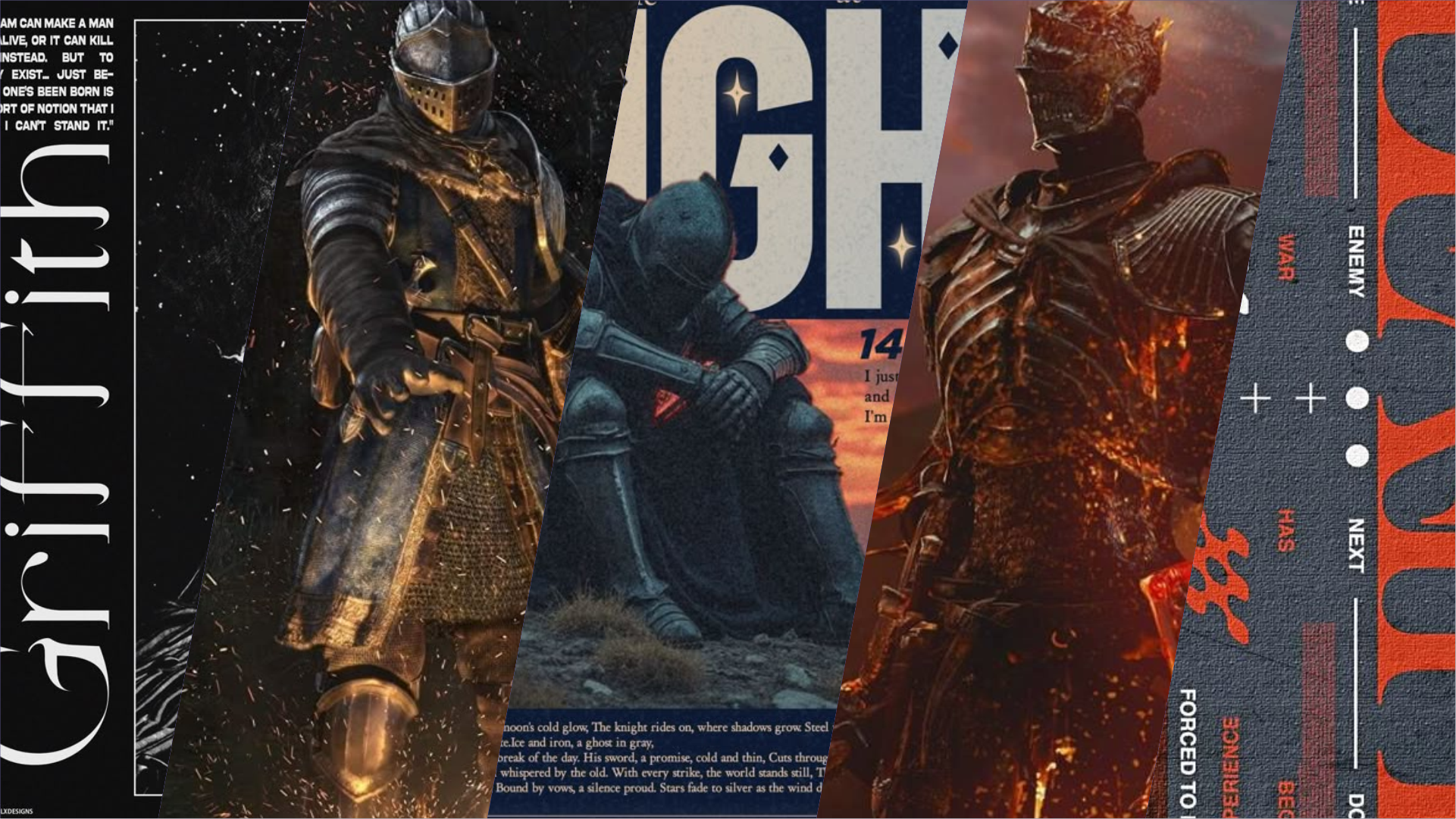
The Research
During the research phase, I dove into dark fantasy themes, studying the visual language of both games and design. The goal was to create something that felt mysterious and powerful but still clear and functional. I explored symbols, colors, and typography that could carry that weight, blending the gritty, immersive feel of RPG worlds with a design system that was practical and easy to understand. The result was a look that feels fresh yet familiar, striking a balance between fantasy storytelling and effective branding.

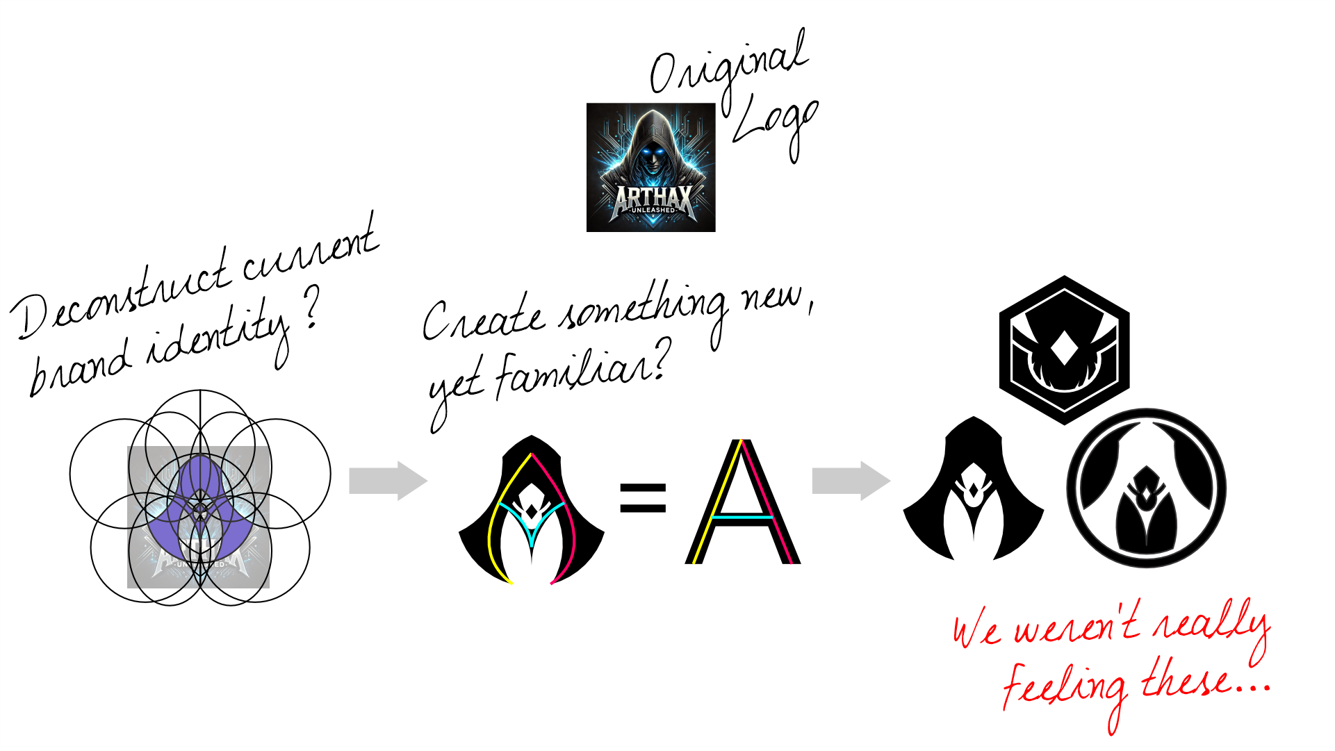
The Concepts
When developing concepts, I explored a range of ideas, from straightforward, literal designs to more abstract interpretations. I studied iconography from early medieval periods, looking for visual cues that felt authentic yet adaptable. This included researching symbols across different eras that align with dark fantasy themes — marks of power, protection, and identity. The goal was to find something that felt timeless, carrying the weight of old legends while still feeling bold and fresh for a modern audience.
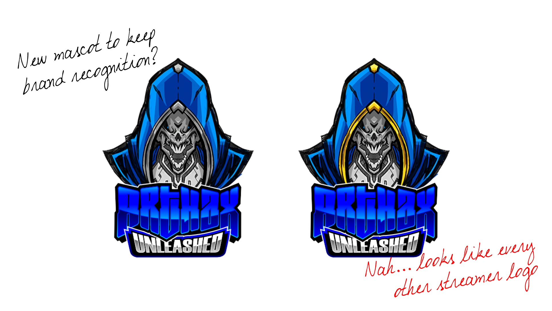
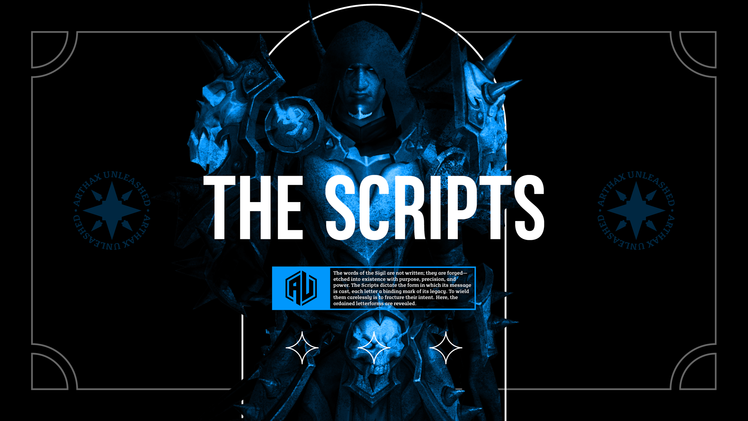
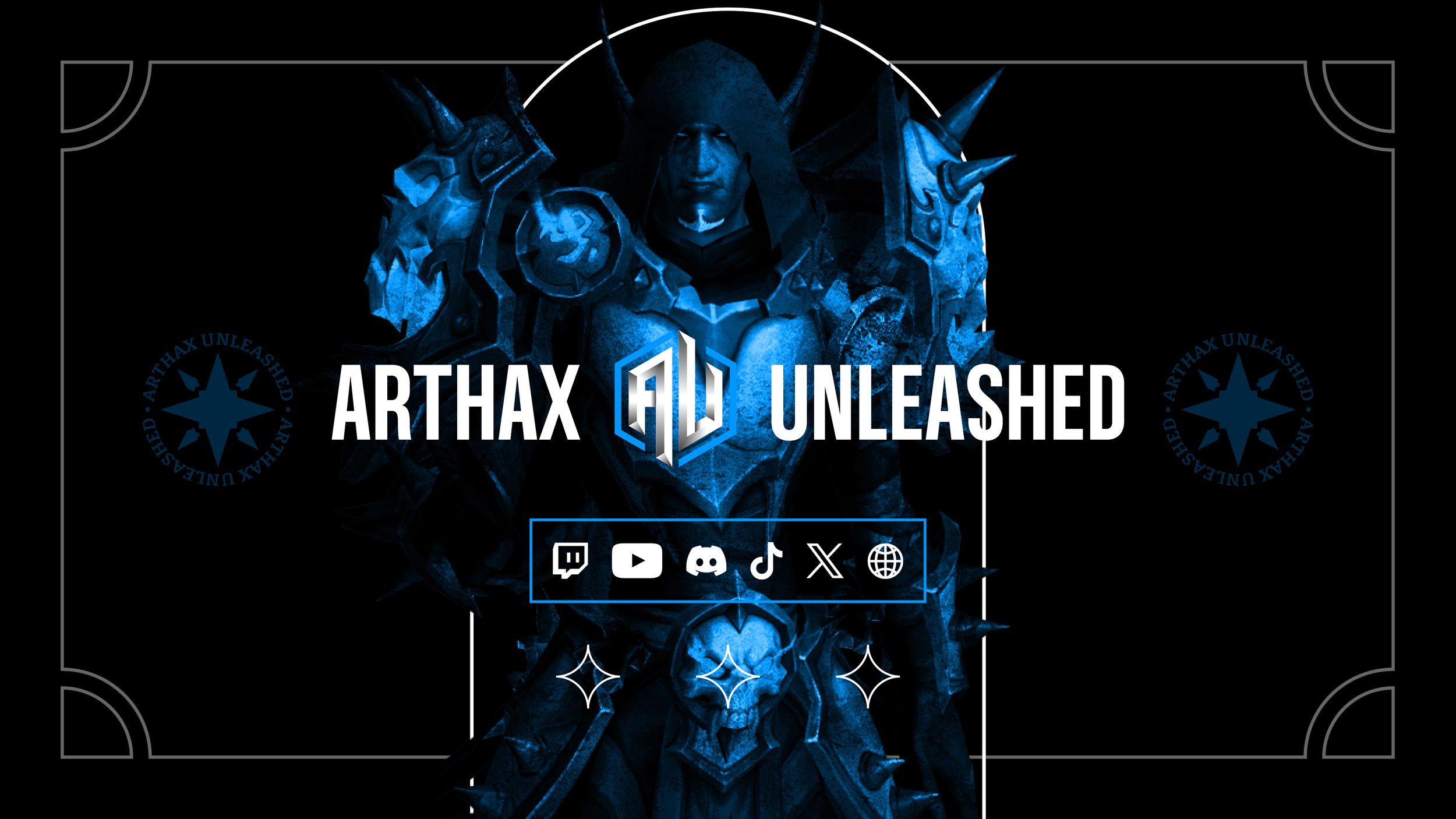
The Final Design
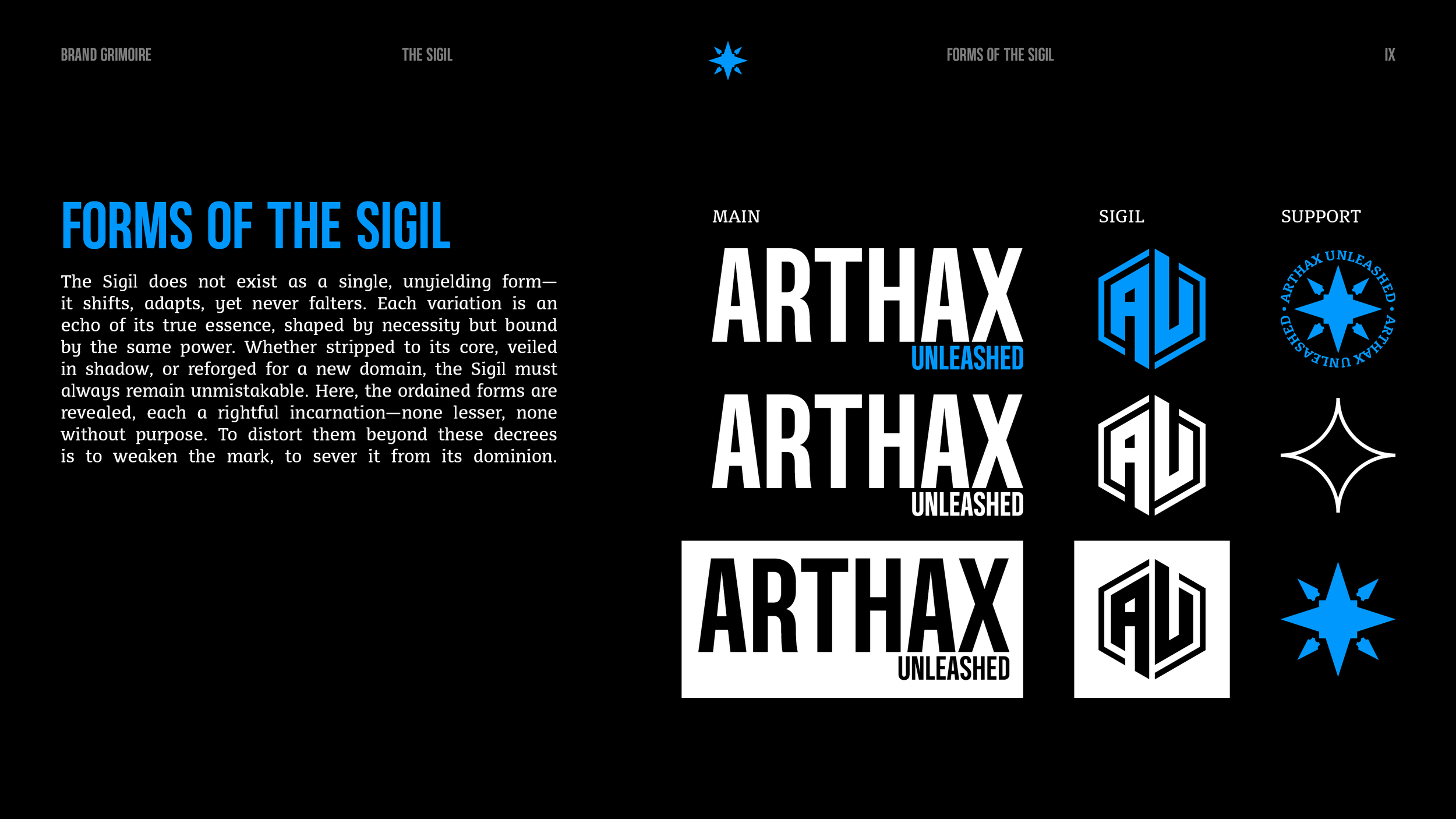
For the final design, we wanted the logo to be clean and simple while still reflecting the dark fantasy style. A bold Gothic font gave it impact, while the hexagonal shape from the original brand kept it familiar. To bring more of that dark fantasy language to life, we would introduce supporting icons such as smaller details that add depth without overcomplicating the main design.
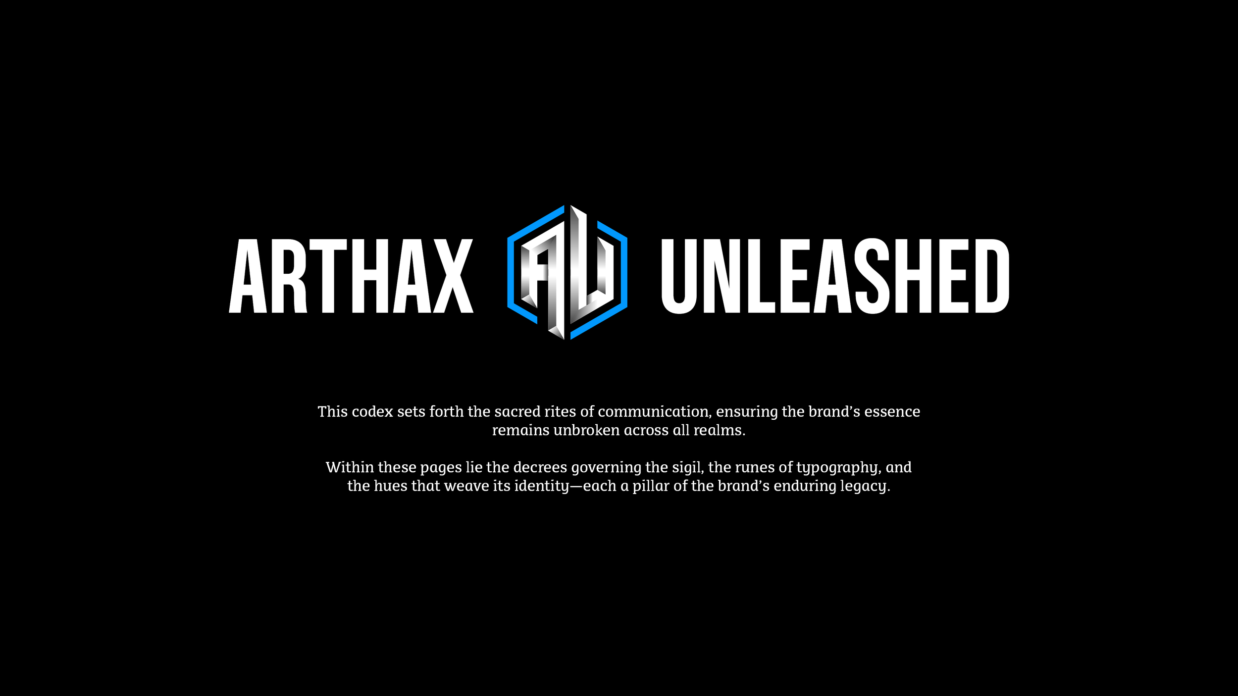
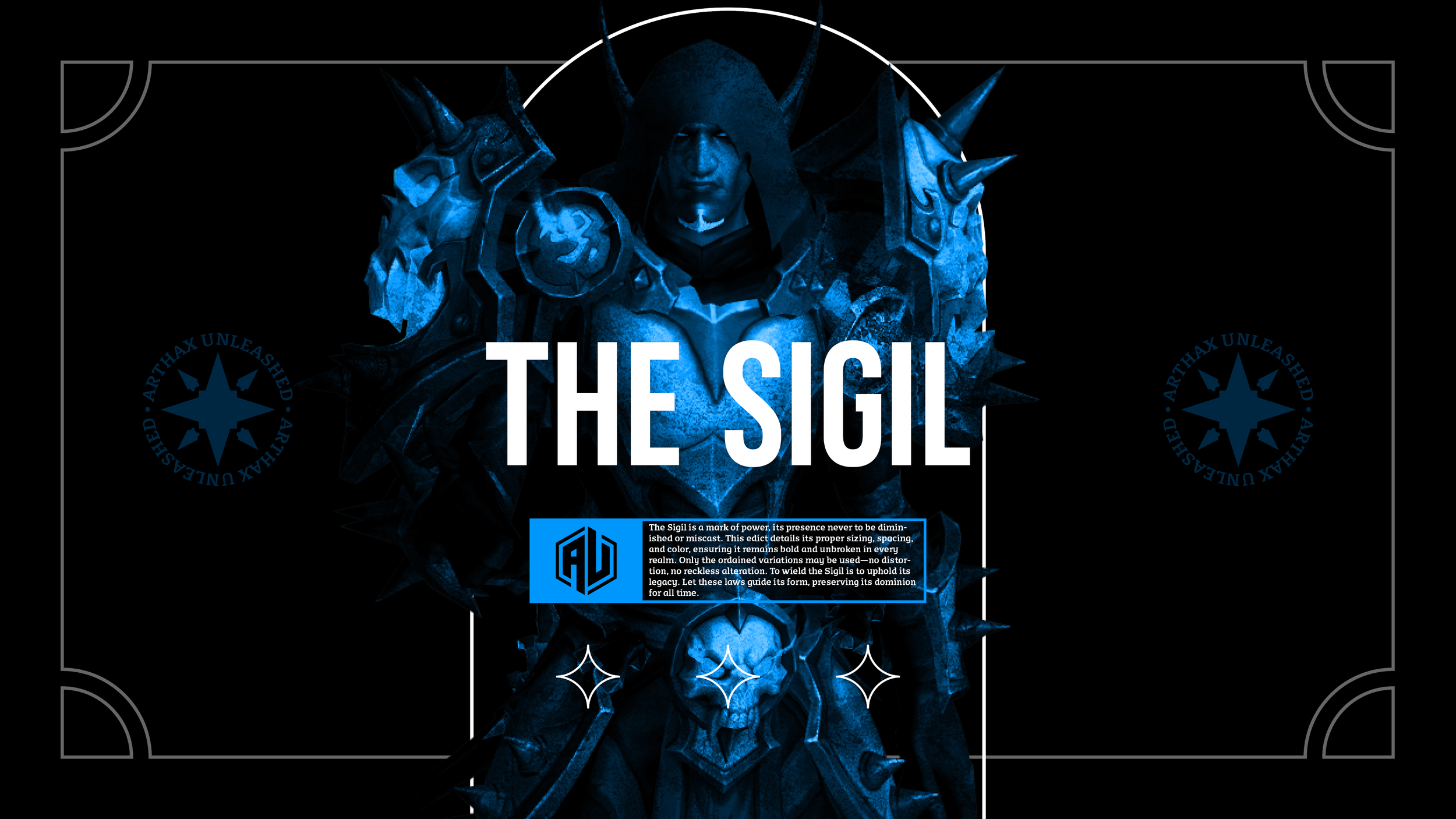
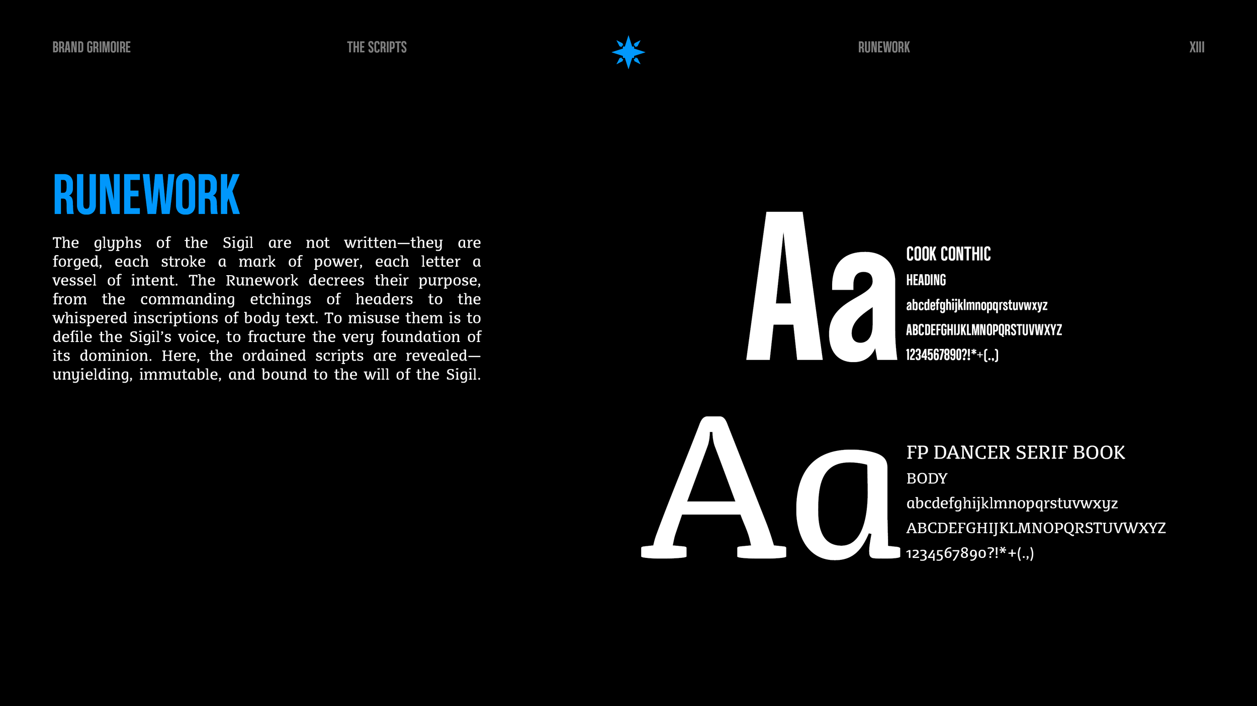
Forging the Guide
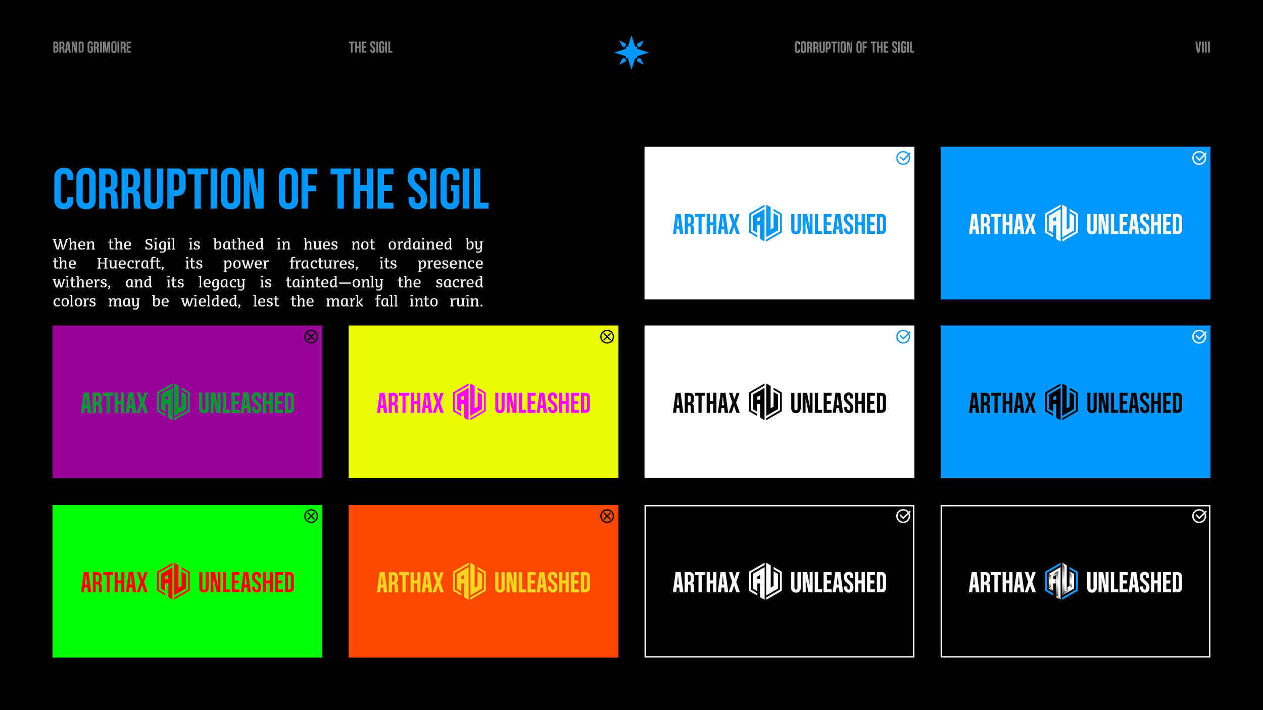
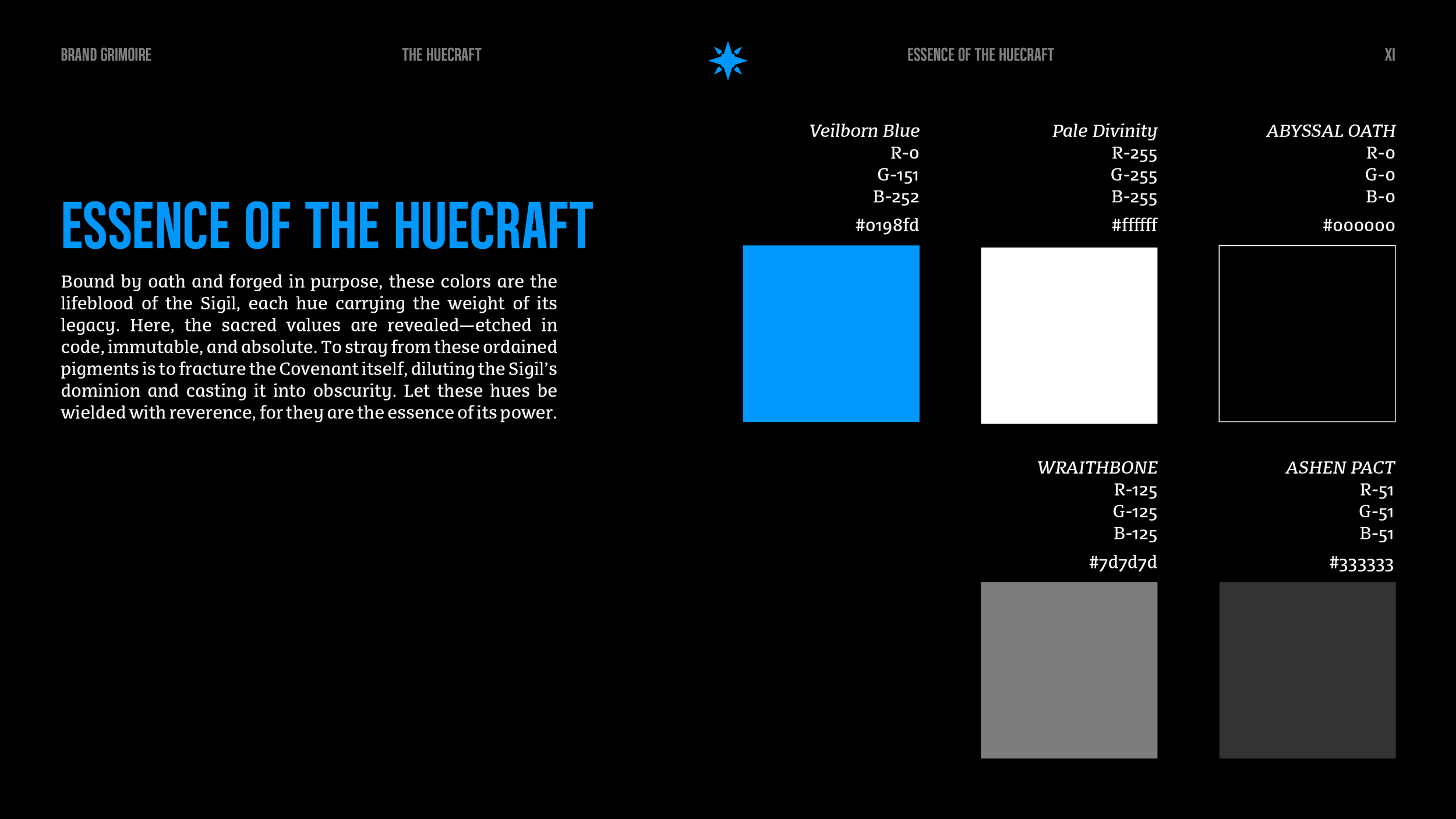
To ensure the logo and supporting designs were always used correctly, I created a brand guide that outlines everything, from logo placement to color choices and typography. Staying true to the dark fantasy vibe, the guide itself was designed with that same tone in mind, blending clear instructions with rich, atmospheric visuals. The goal was to make it practical yet immersive, a tool that feels like an extension of the brand rather than just a set of rules.
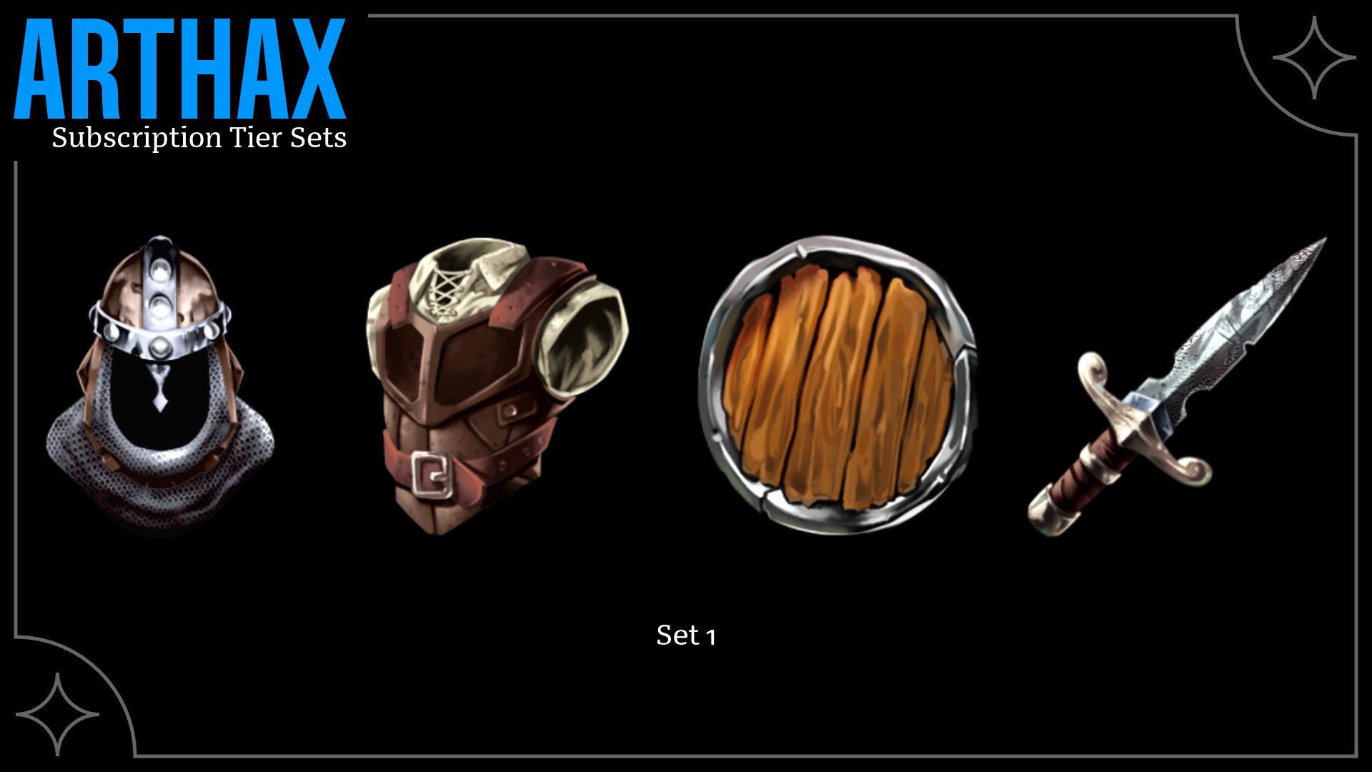
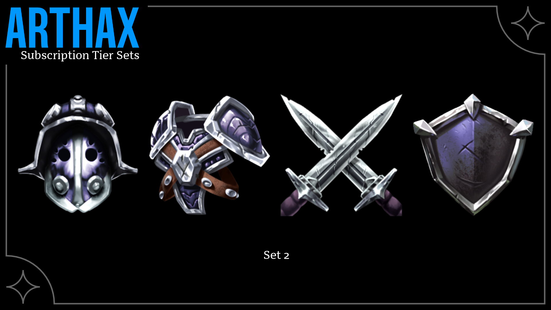
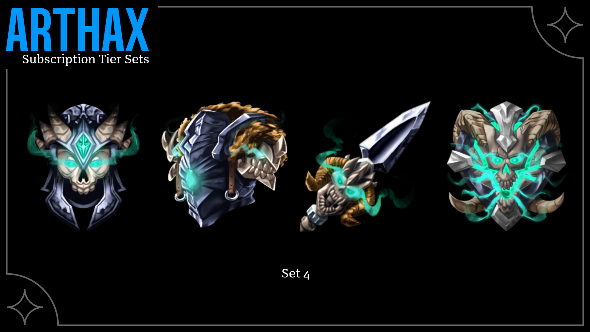
The Subscriber’s Journey
For the subscription tiers, we leaned into the dark fantasy vibe and built a system that feels like leveling up in an RPG. The longer someone stays subscribed, the better their gear becomes, just like in a game. Each tier unlocks upgraded armor, starting with basic equipment and progressing to powerful, battle-ready designs. It’s a fun way to reward loyalty while tying directly into the fantasy world Arthax’s audience knows and loves.
The Sketches
Before finalizing the designs, I sketched out all the subscription tiers to map out the visual language and ensure the progression felt right. I wanted each upgrade to feel exciting, like earning stronger gear in an RPG. The pacing was key; each new tier needed to feel like a clear step forward without losing momentum. Sketching everything first helped me balance those "wow" moments, making sure each design felt rewarding and impactful.

The Merchandise
As part of the design package I offer, I like to provide at least one shirt design utilizing the rules set up within the Brand Guide. Since I have such a large background in screen-printing, I am able to set up the file, personally, to ensure that the merch is printed exactly as it needs to be for both longevity and clarity.

Worn With Purpose
For the T-shirt design, I wanted to keep that dark fantasy vibe front and center. I leaned into a worn, eroded look, something that felt like it was pulled from the pages of a forgotten manuscript. The design has a rough, textured style, almost like it’s been weathered over time. The goal was to create something that felt mysterious and powerful, yet still wearable and visually striking.