
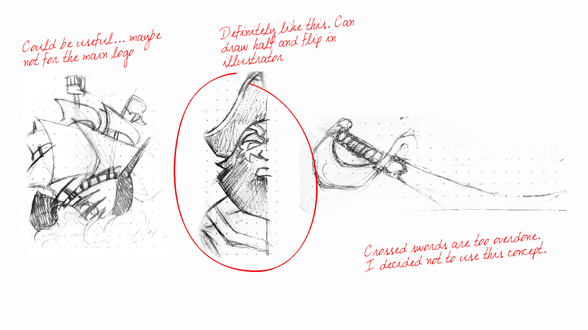
Initial Sketches
These are the first sketches that kicked the project off. I wanted to tap into South Carolina’s deep pirate history since it gives the team a bold identity that feels rooted in the state. The goal was to explore shapes, symbols, and attitudes that could carry that energy. Even in the rough stage, the idea of a pirate influenced team felt exciting and easy to rally behind.
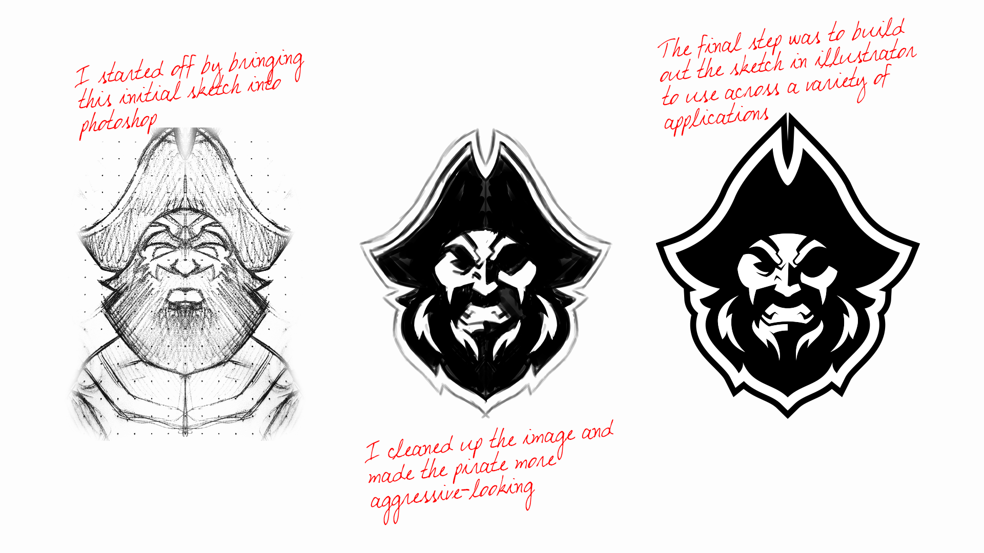
Cleaning Up
This stage shows how the sketch turned into a usable mark. I duplicated and mirrored the original drawing in Photoshop to lock in the symmetry, then sketched over it to tighten the shapes and details. From there, the design was rebuilt as clean vector artwork in Illustrator. It’s the point where the idea shifts from a rough concept to a real, functional logo.

Finding the Palette
This round focused on testing colors and seeing how the mark behaved in different palettes. I explored a range of options before narrowing in on tones that tied back to the South Carolina flag and the coastal environment. Pulling from the ocean and state symbolism gave the logo a clearer sense of place. It helped lock in a palette that feels authentic to the team and the region.

Full Logo Design
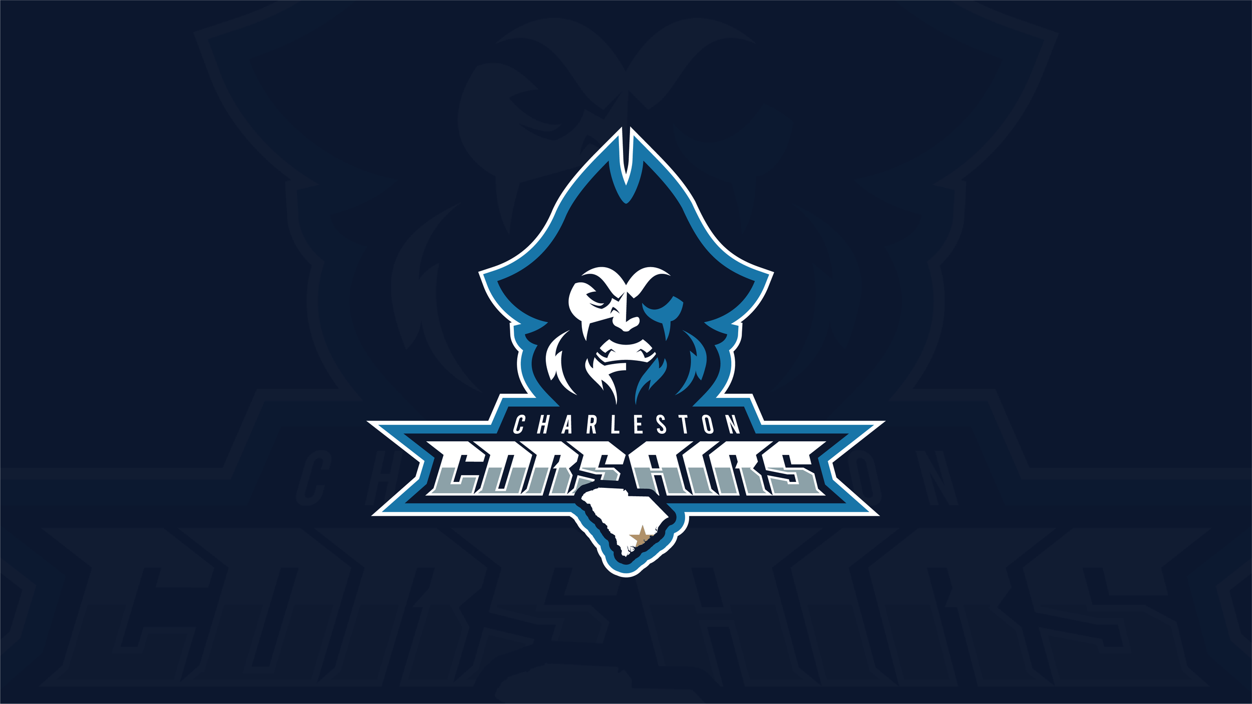
This step was about building out the full team identity by combining the mark with type and supporting elements. I explored how the pirate icon could sit alongside “Charleston Corsairs” in a way that felt balanced and strong. Adding the South Carolina state shape and a star near Charleston helped ground the logo in its home state. It was a way to show pride, location, and team identity all in one unified lockup.
The logo was also created to work without the pirate icon, when needed.
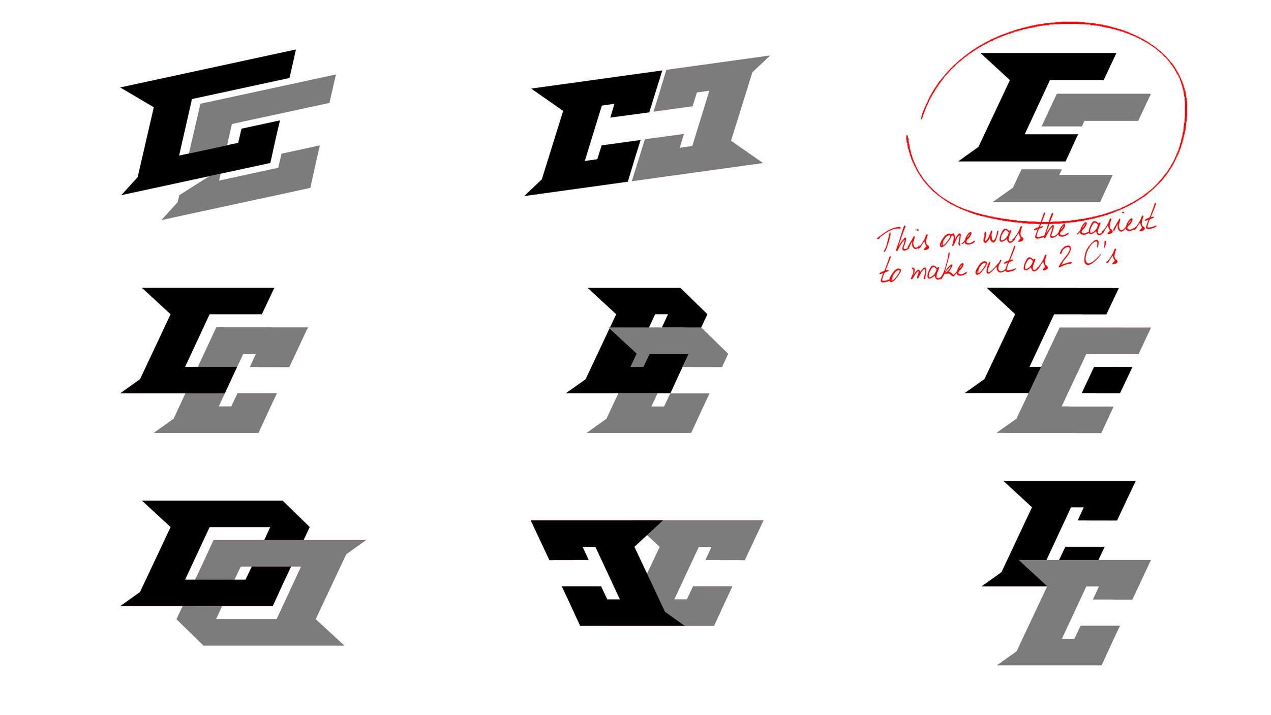
The Team Mark
The dual C mark went through a lot of exploration before landing on the final version. I tested different shapes, angles, and weights to find something that felt fast and energetic without losing clarity. The goal was to create a symbol that worked on its own, stayed readable at any size, and still carried the attitude of the team. The final mark hits that balance and gives the Corsairs a strong, versatile identity piece.
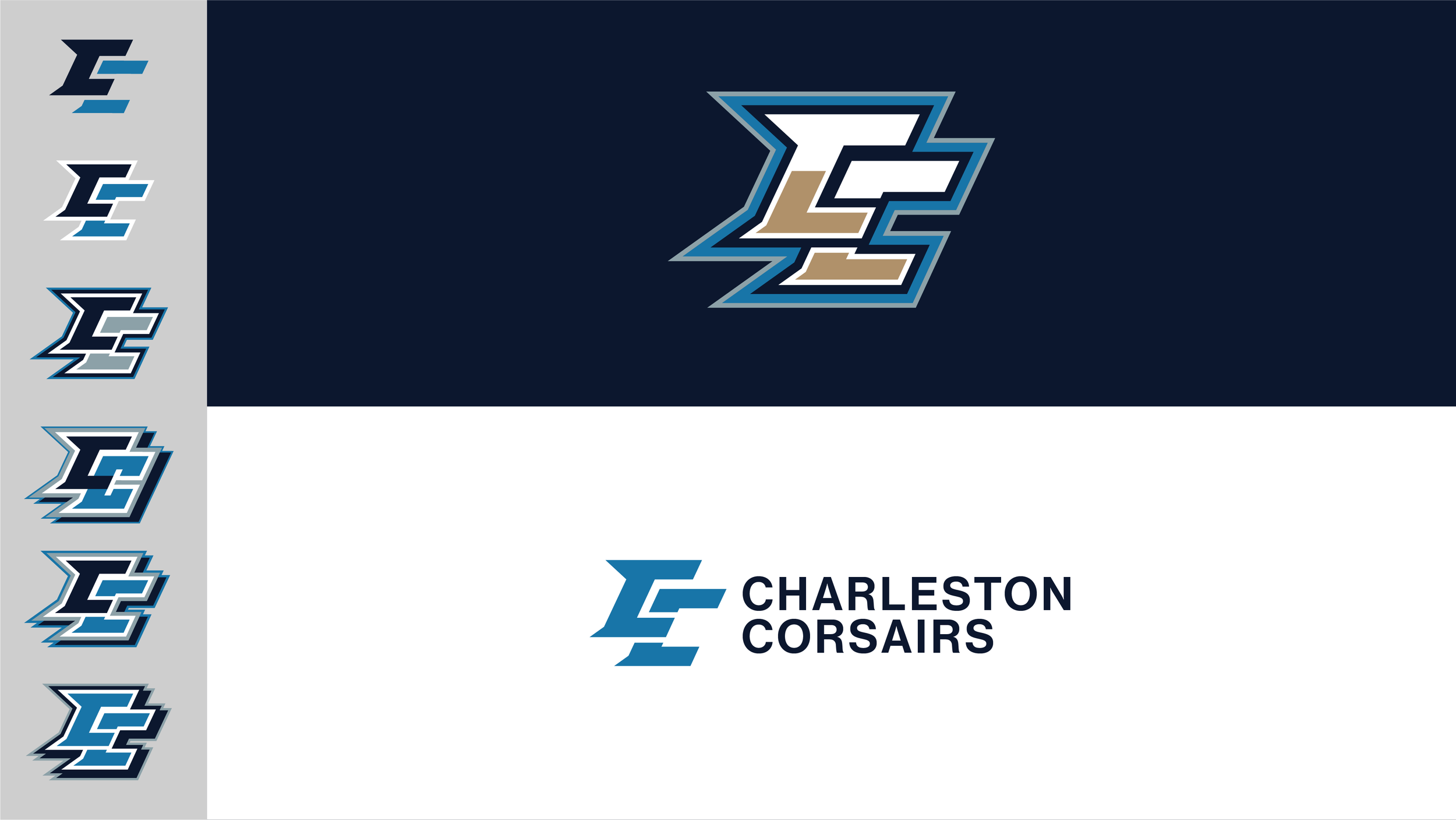
Finalizing the Team Mark Color
This stage shows how the team mark came to life once the full palette was defined. I ran through several color combinations using the brand colors to see how each version carried the energy of the mark. That exploration led to introducing a new tone that helped everything click. The image walks through the iterations on the left, ending with two final versions on the right that show the mark on its own and paired with the supporting Charleston Corsairs type.
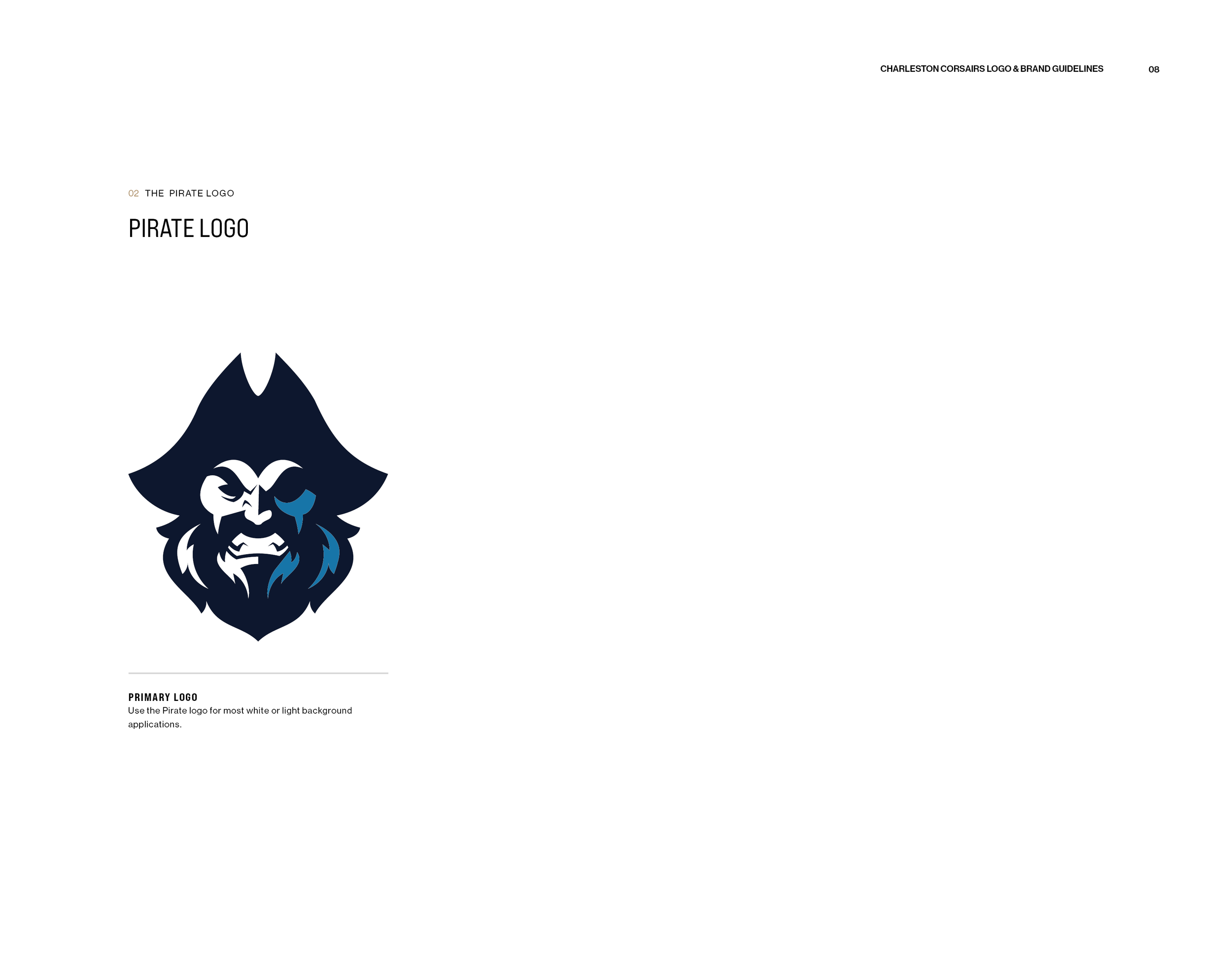
The Brand Guide
The brand guide lays out the full identity system for the Charleston Corsairs. It covers the core logo, color palette, typography, usage rules, and supporting elements so the team’s look stays consistent anywhere it appears. Every detail is documented, from how the mark should be displayed to which fonts belong in which situations. It’s a complete reference that keeps the brand clear, recognizable, and easy to use across any platform.


The Team’s Look
I also felt that it would be beneficial to design the actual uniform that the team would be wearing on gameday, as well.


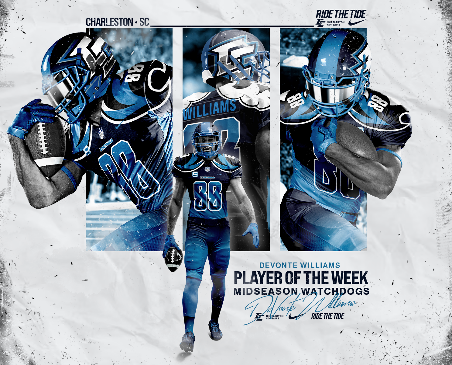
Designs In Action
Finally, I wanted to create some posters using the images I created for the player’s uniforms. These were meant to simulate what social media or advertisements would look like.