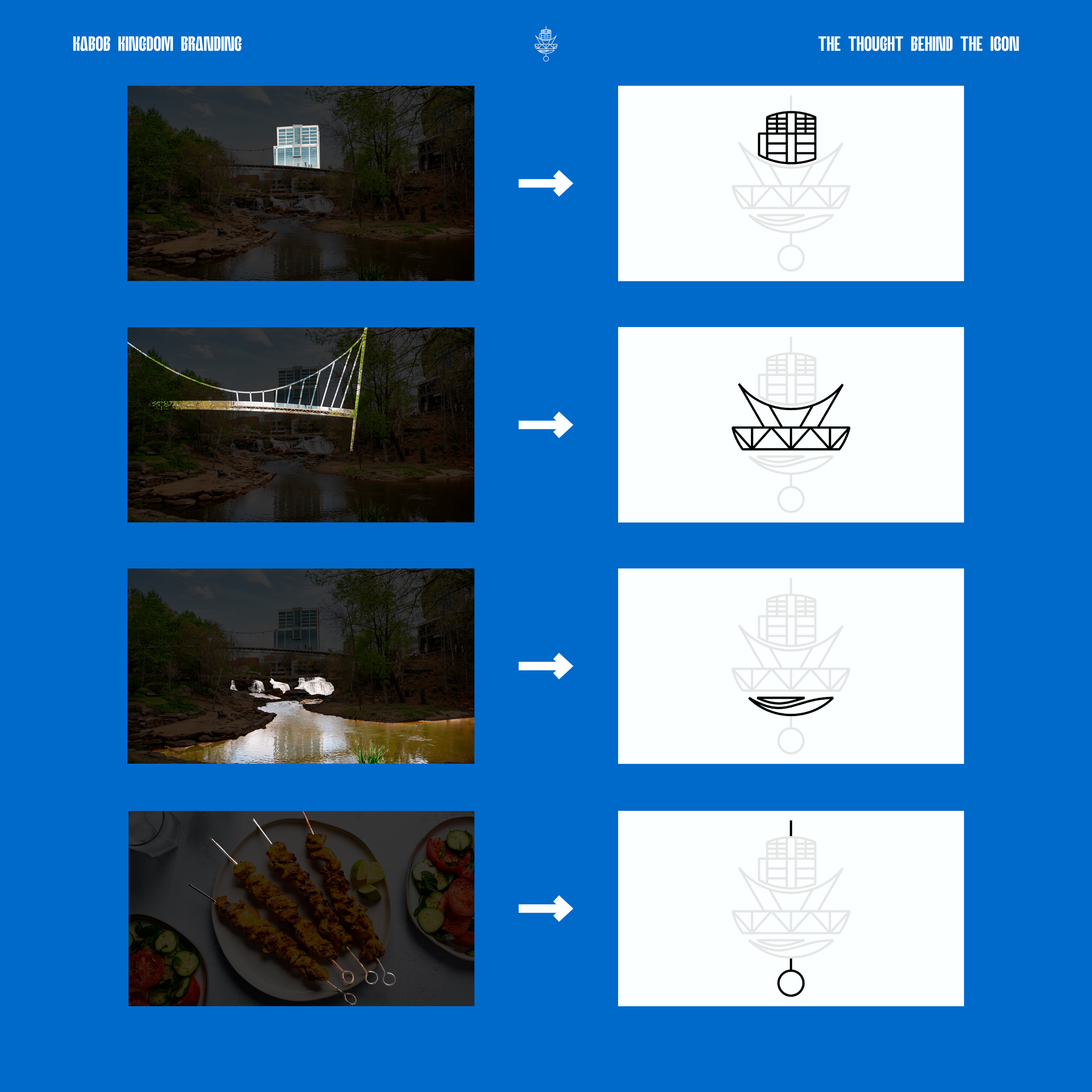
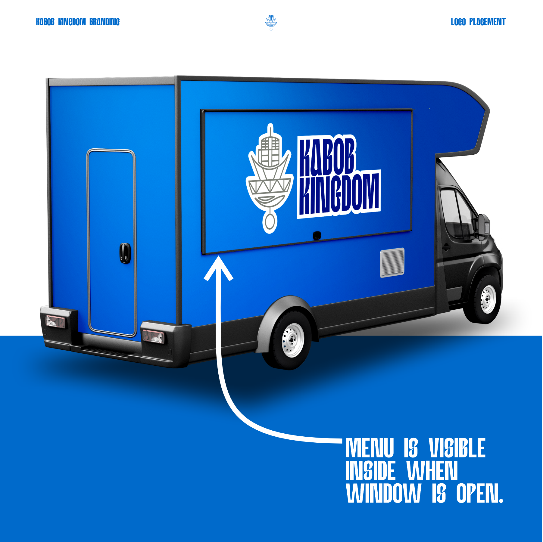
Stacked with Meaning
To make the Kabob Kingdom icon feel rooted in Greenville, I built it using the city itself. Each piece of the logo comes from a recognizable landmark: the iconic Bank of America building downtown, the Liberty Bridge, and the Reedy River Falls. I stacked them vertically to form a kabob, then added a skewer to pull the whole concept together and turn the city into a symbol of the food they serve.
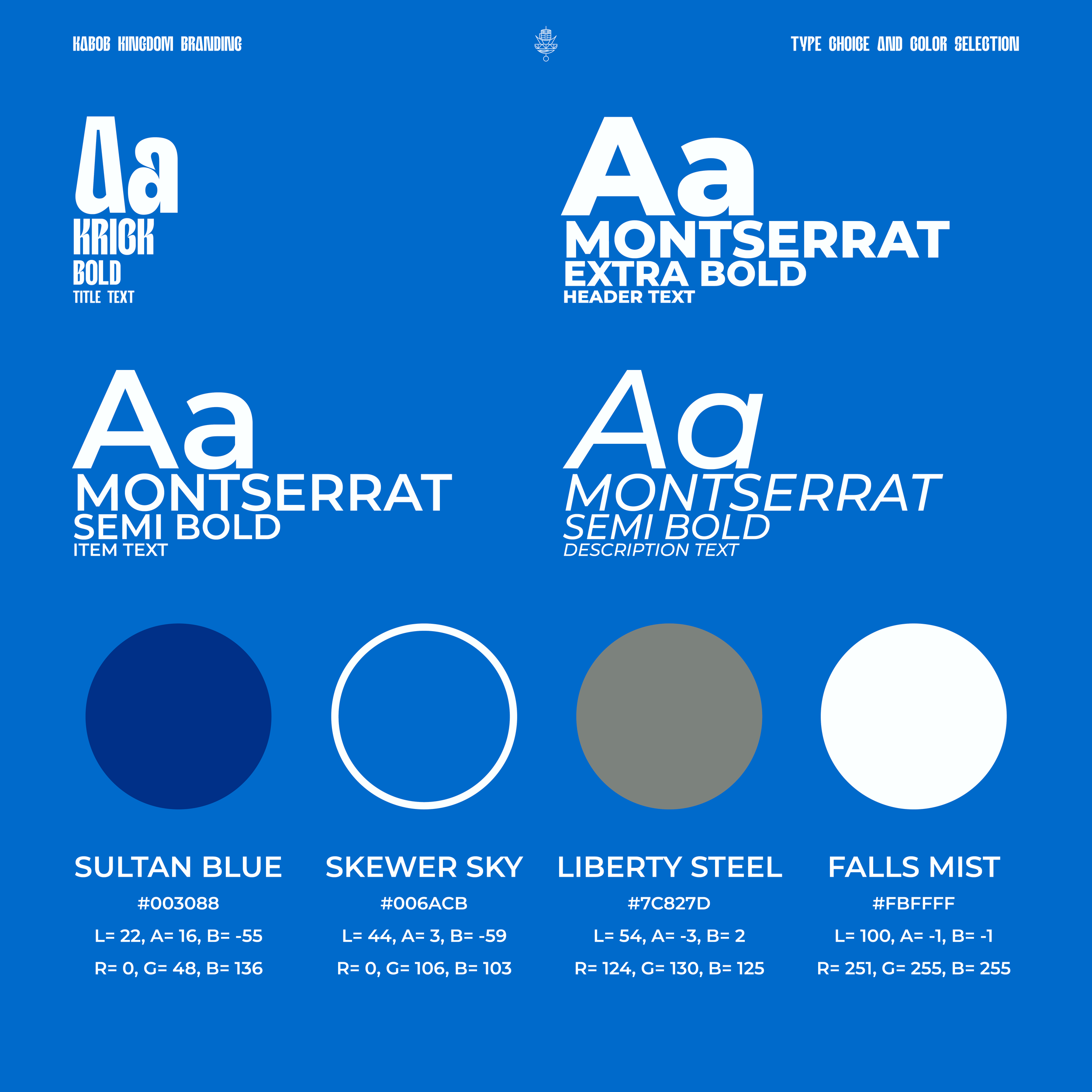
The Flavor of Type
For the main logo, I went with KRICK Bold, a loud and condensed typeface that brings a strong presence and a subtle nod to Middle Eastern design. It stands out without leaning on overused fonts like Bebas or Press Gothic.
For the body text and menu items, I chose Montserrat in Extra Bold, Semi Bold, and Medium Italic. It keeps everything clean and readable, especially important for menus and small signage.
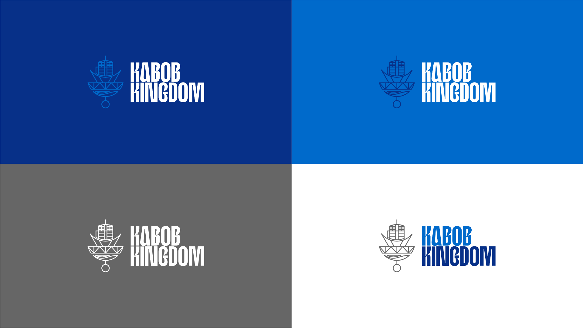
Color Connections
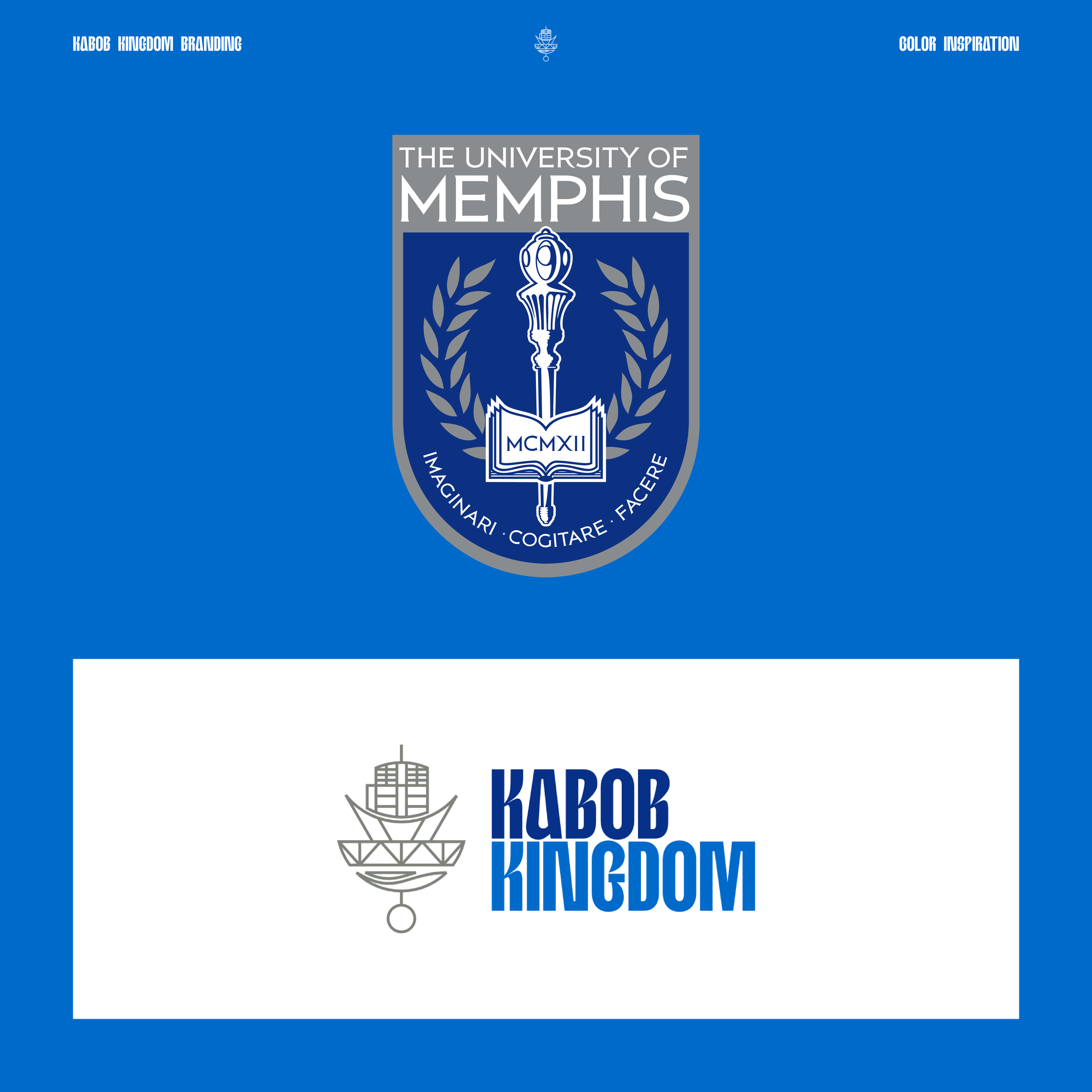
The color palette started with the truck itself. The owner bought it in a light blue, so I built the brand around that foundation. The main blue, named Skewer Sky, matches the truck and keeps everything visually cohesive. There’s also a subtle nod to the University of Memphis, the owner’s alma mater, which helped guide the overall palette. It’s personal, practical, and instantly recognizable.
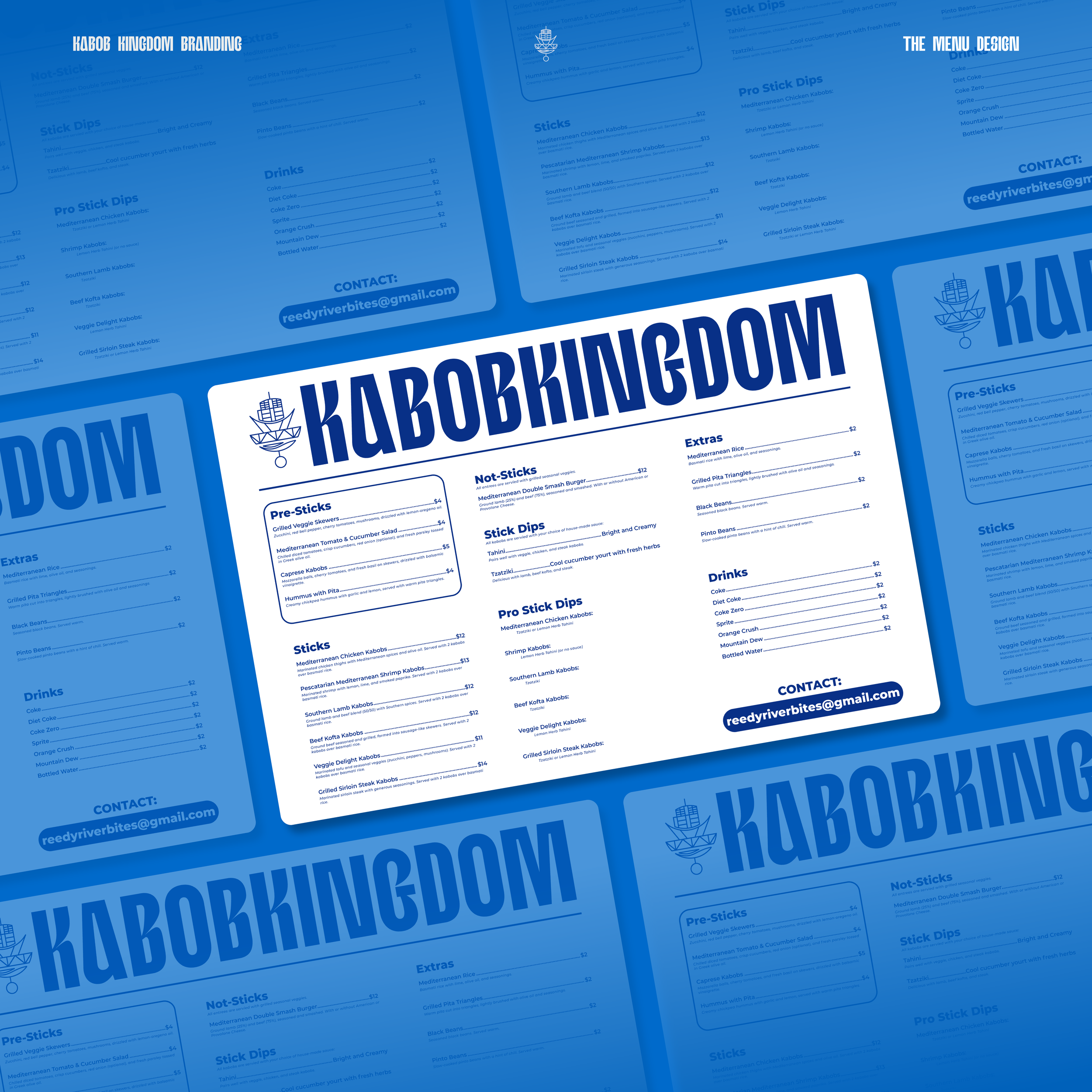
Keep It Simple, Serve It Fast
For the menu design, I focused on clarity over decoration. A clean layout always beats a busy one, especially when customers are trying to make a quick decision. I kept the structure straightforward so people could find what they’re looking for without scanning through clutter. Simple hierarchy, legible type, and smart spacing make the whole thing feel easy to use and quick to read.