
Phase 1: The Beginnings
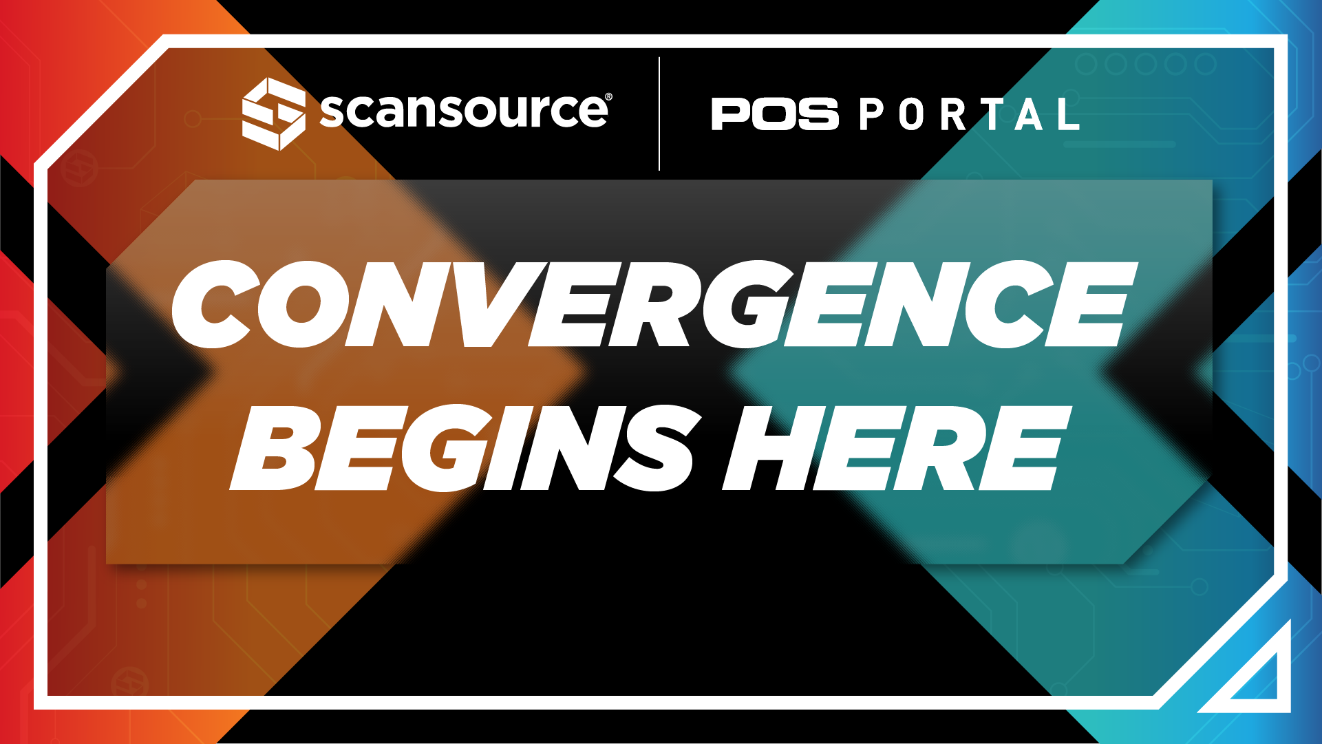
This campaign also had to carry a bigger idea the company was pushing that year: Convergence. Not just as a message, but as something you could feel in the space. The challenge was balancing multiple variables at once. Two brands with different equities, a unified offering, and a theme centered on systems coming together. The solution was to treat convergence as both concept and structure. Independent elements designed to operate on their own, but built to connect seamlessly through shared motion, geometry, and flow.
All The Concepts
Here’s the complete range of concepts I created that were all aimed at solving the same problem through different visual languages. All of these were designed while thinking about how following collaterals would work across various channels.
Easy Iterating
In order to present each iteration, and without having to superimpose the images every single time, I created a mockup utilizing a 3D rendering of the booth. I wanted to be able to showcase the booth within a 3 dimensional space so the stakeholders could get a better understanding of how it would look when set up.
Phase 2: Iteration
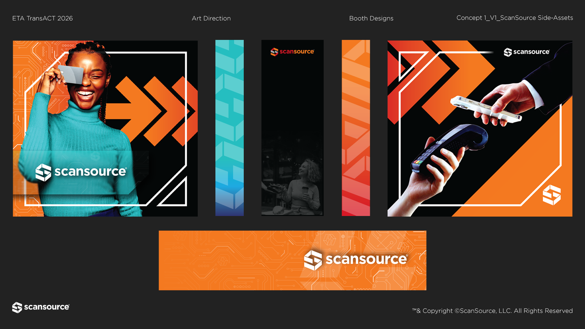
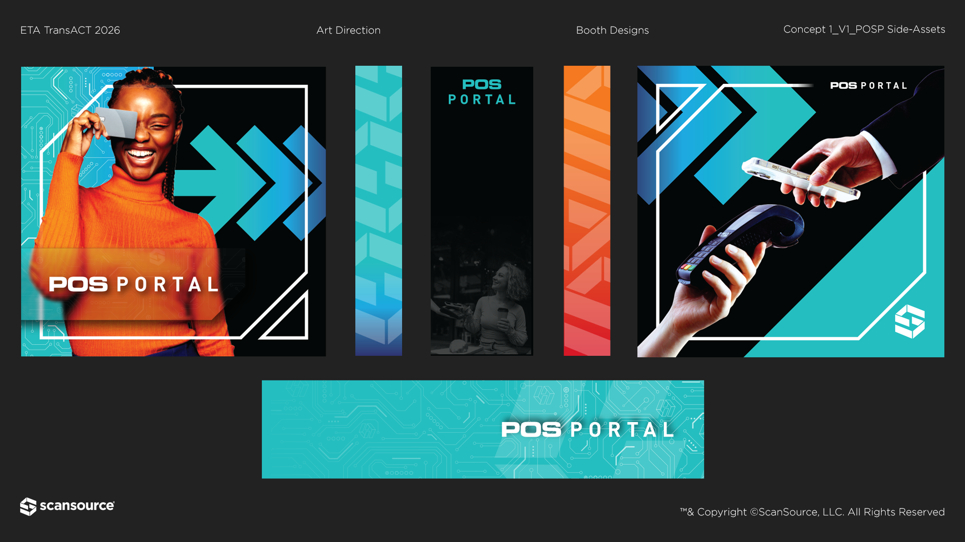
Concept 1
This direction uses motion to express transaction. Every element pushes forward, turning the space into a visual flow rather than a static display. Color contrast sharpens that idea. Teal and orange create a clear handoff between two sides, reinforcing the transfer at the core of the payment process. The central wall anchors it. Drawing from The Creation of Adam, the near-contact moment becomes a symbol of exchange. Not decoration, but connection. Two forces meeting to complete the transaction.
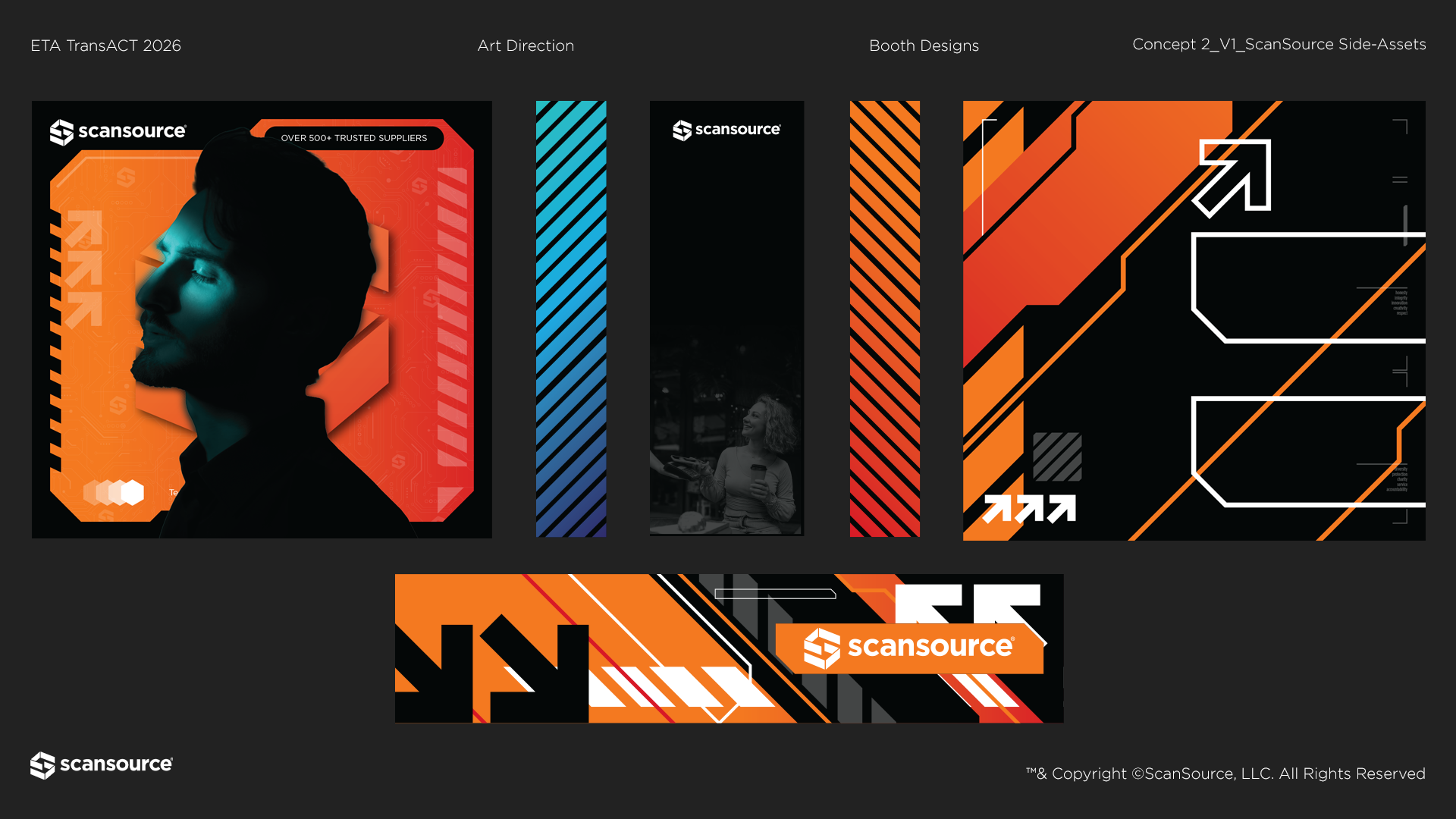
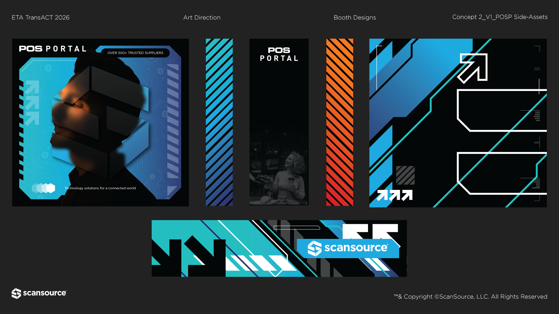
Concept 2
This direction focuses on perception over process. Instead of showing the system, it presents how it feels. Clean, precise, and elevated. The visual language leans high-tech. Angular forms and structured lines reflect the infrastructure behind payments, while lighting and gradients add depth and polish. Abstracted model imagery shifts it to human-centered so it becomes less about the product and more about how the experience feels. An editorial, almost fashion-driven approach that positions the brand as a premium, forward-thinking partner.
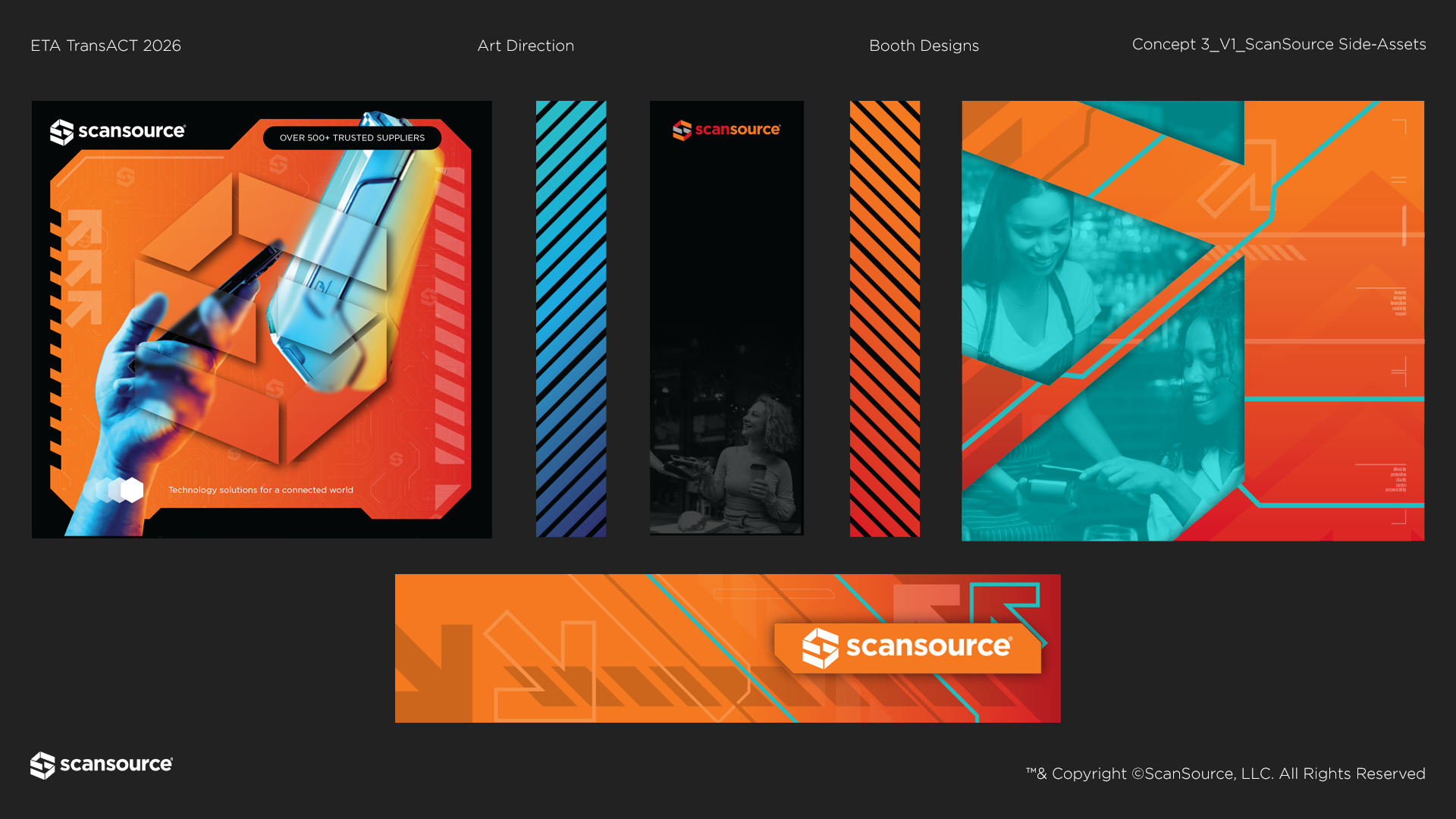
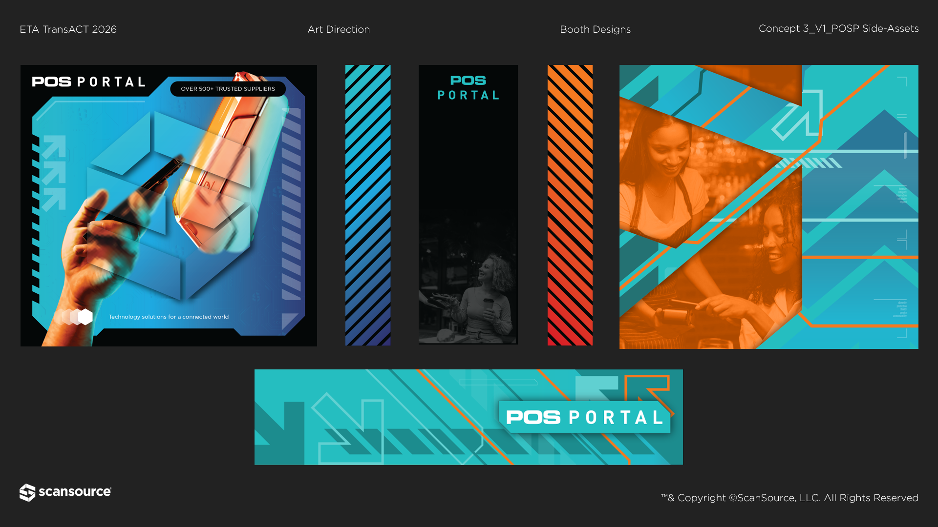
Concept 3
This direction merges system and experience into one language. The high-tech foundation is softened with glass-like layers and transparency, adding depth and a more premium, refined feel. The Creation of Adam reference returns as a subtle cue for connection, integrated into the broader flow rather than standing alone. ScanSource elements are woven throughout, bringing both brands closer together. Not fully blended, but clearly converging.
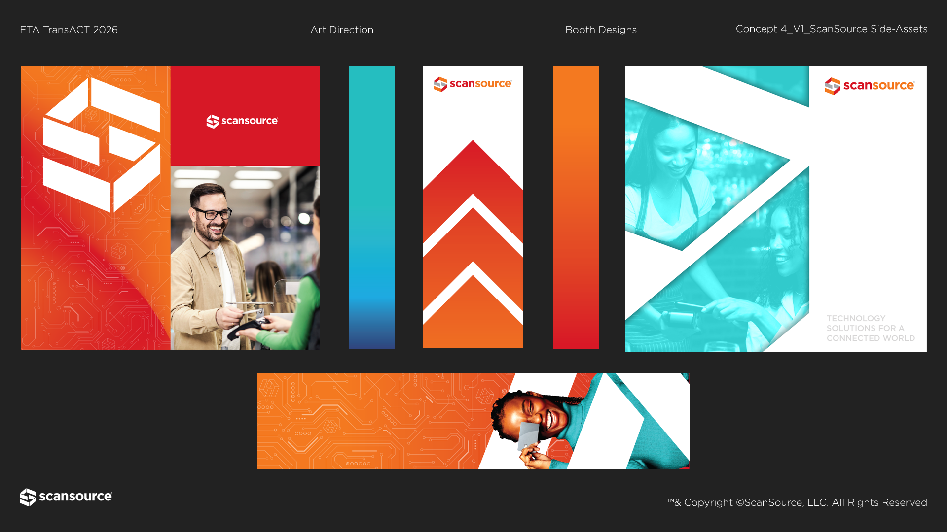
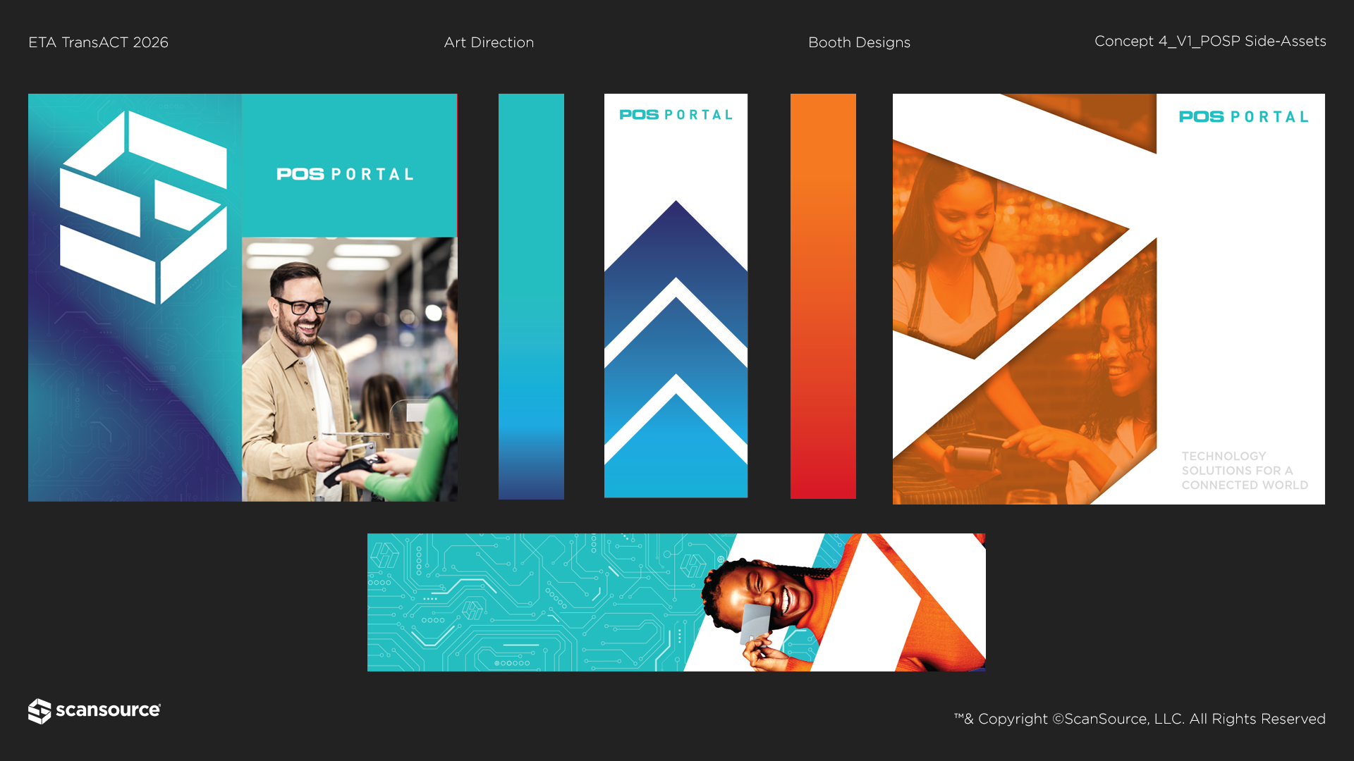
Concept 4
This direction leans into familiarity and energy. Brighter color and open composition makes it feel more approachable and easy to engage. It pulls directly from established brand language, reinforcing trust and clarity with a straightforward, easy-to-read experience.
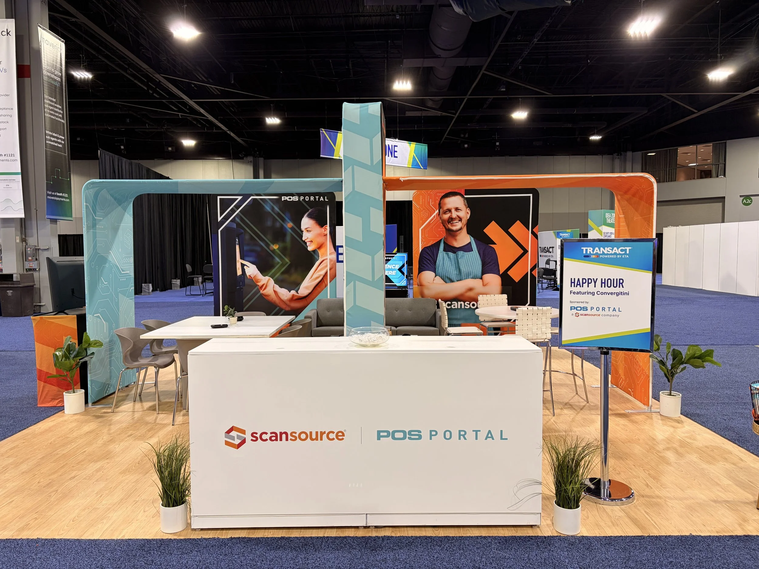
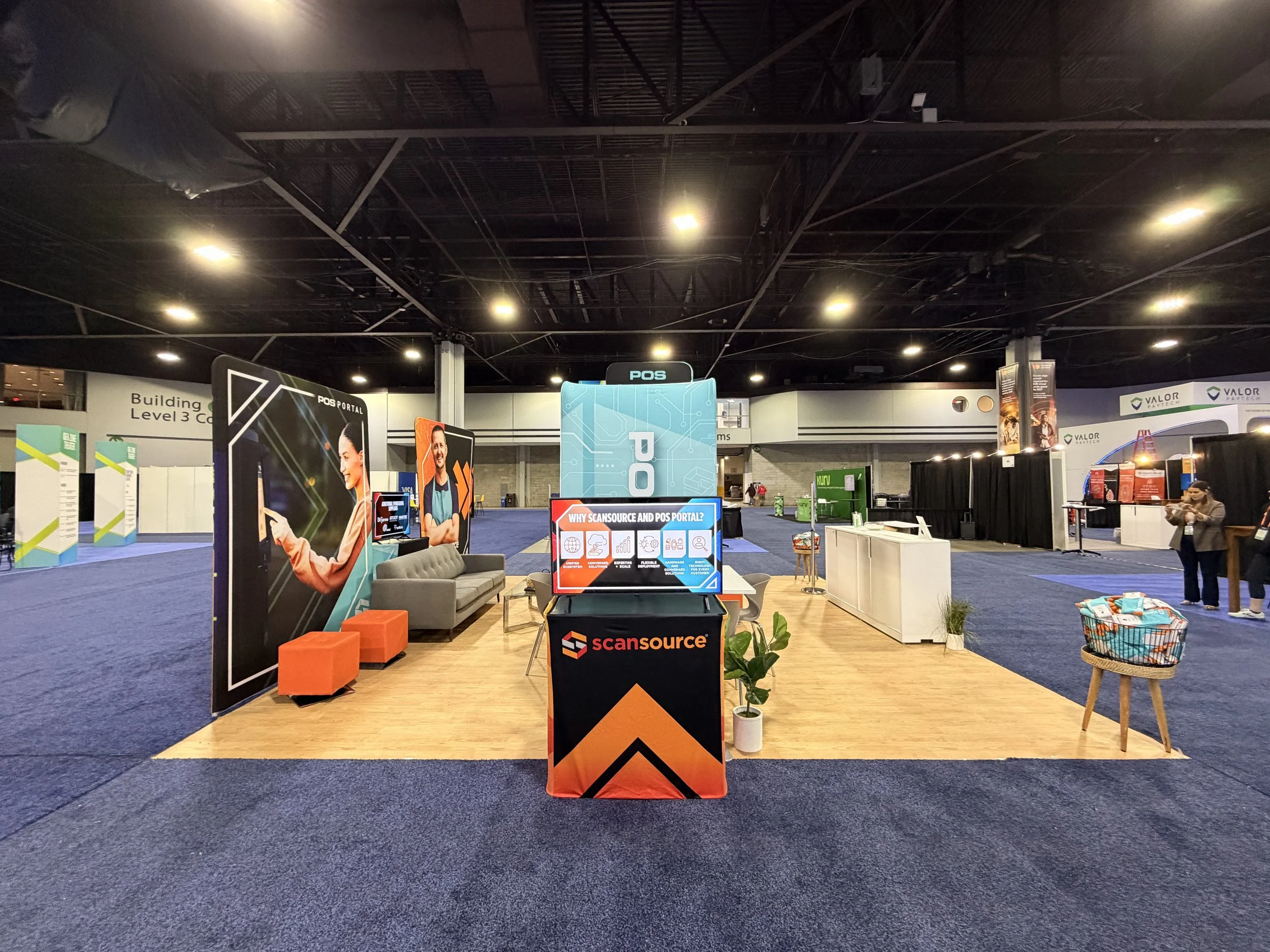
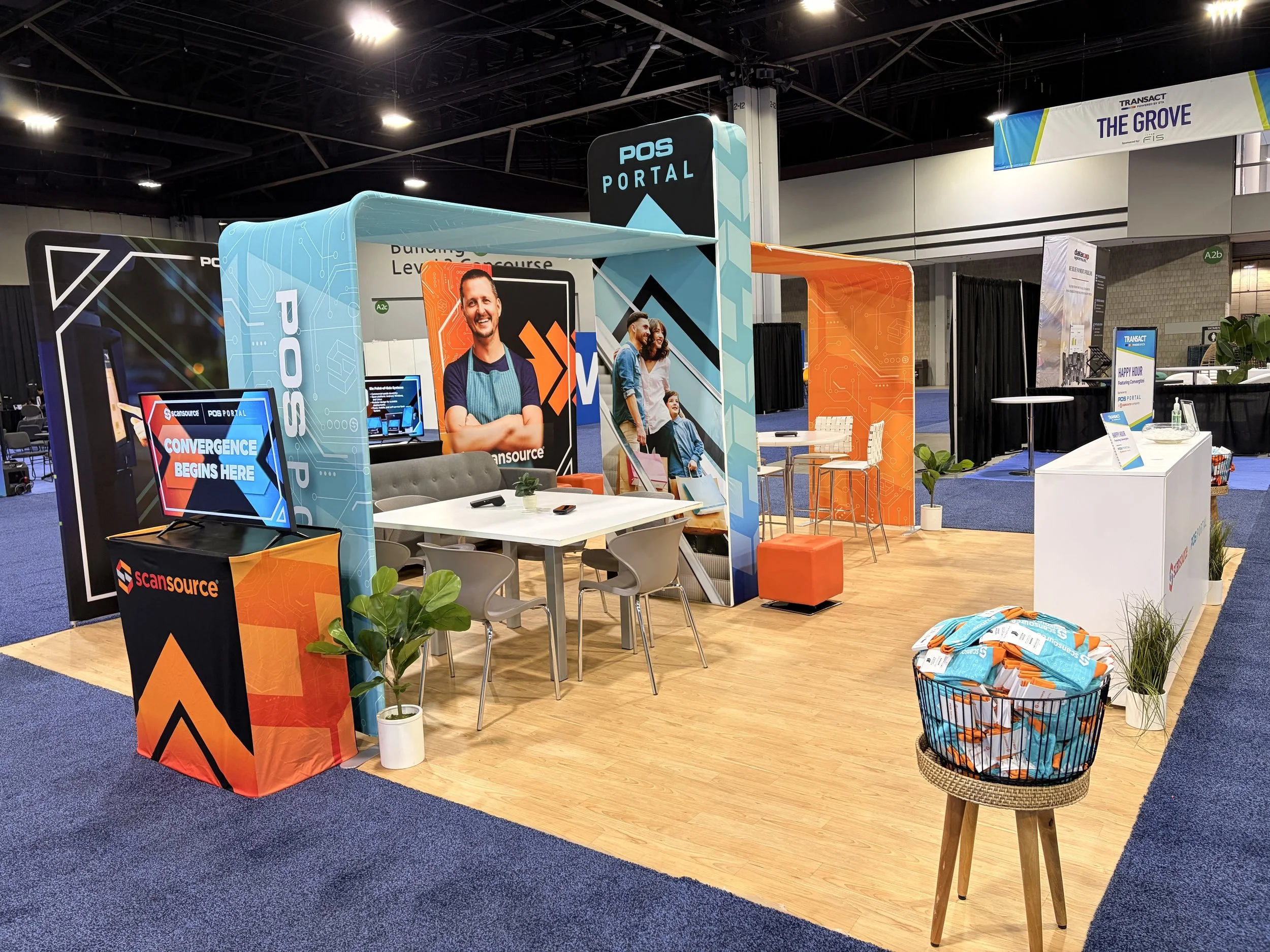
The Winning Design
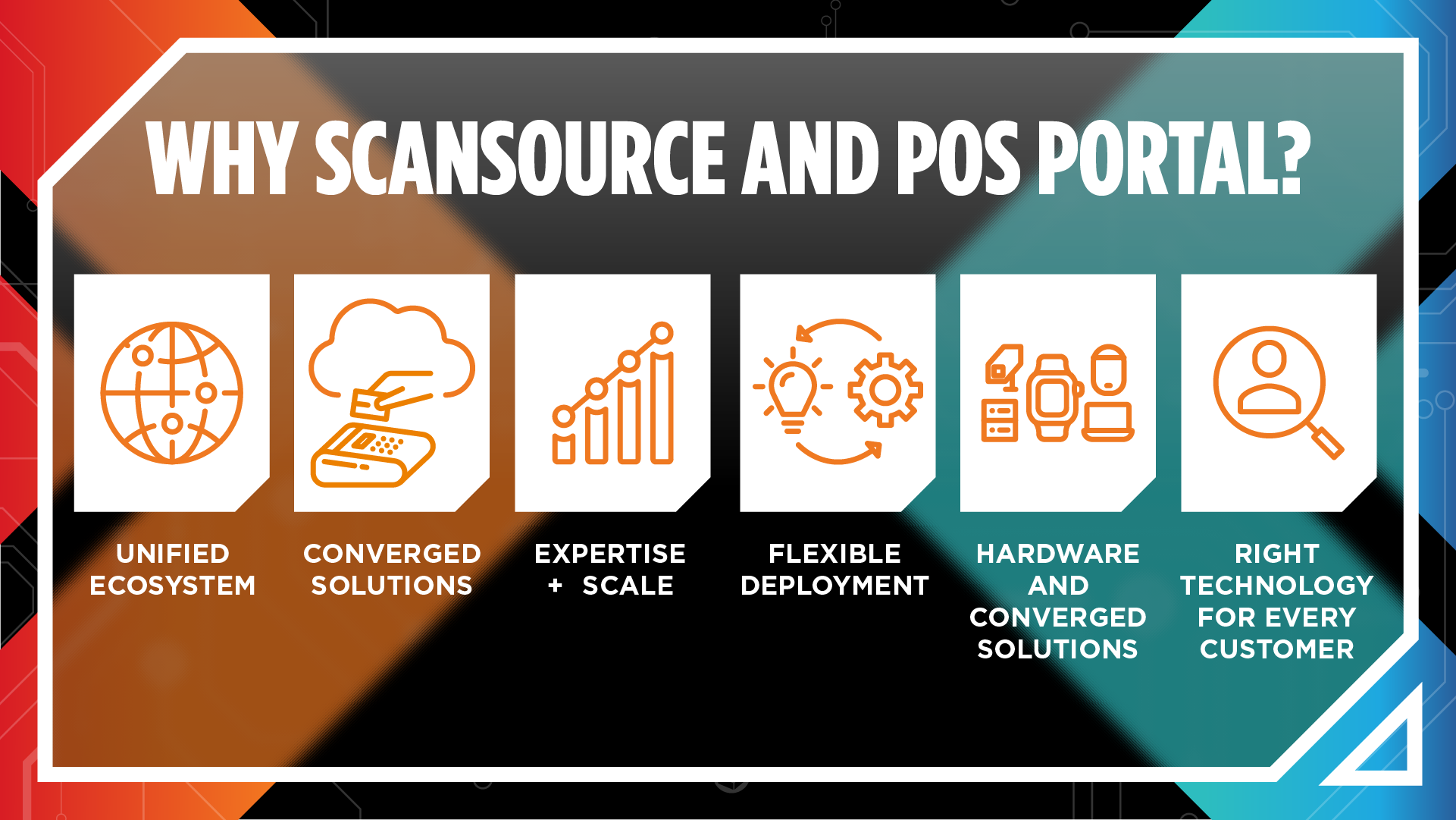
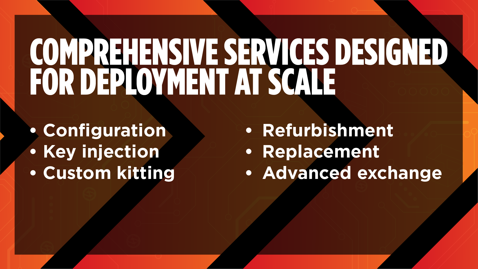
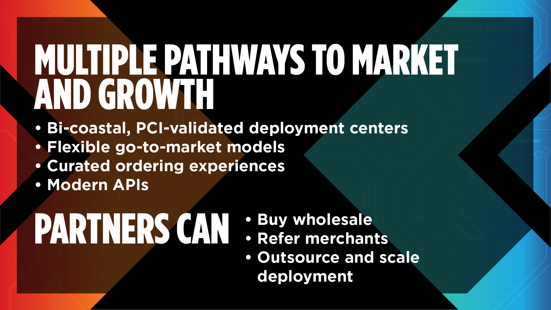
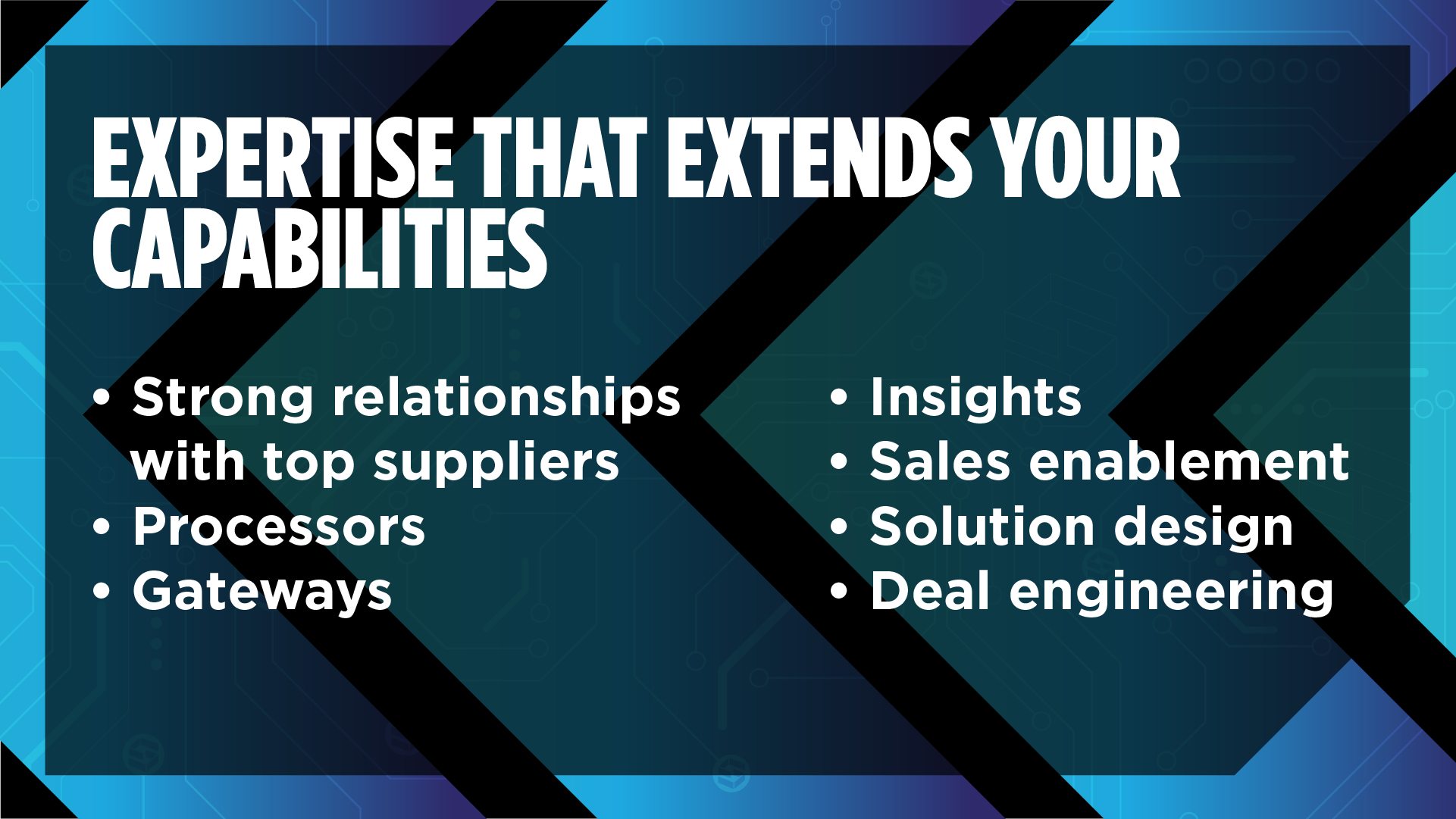
This final direction is the result of iteration, alignment, and shared ownership of the problem. What started as multiple distinct directions converged into a solution that balanced brand equity, clarity, and presence on the floor. Stakeholder input wasn’t a constraint, it was part of the process, helping refine what mattered most. A unified system that reflects both brands while solving for the real goal: showing up with clarity, confidence, and purpose in a crowded space. This final design brings those ideas together and sets the groundwork for the following campaign.
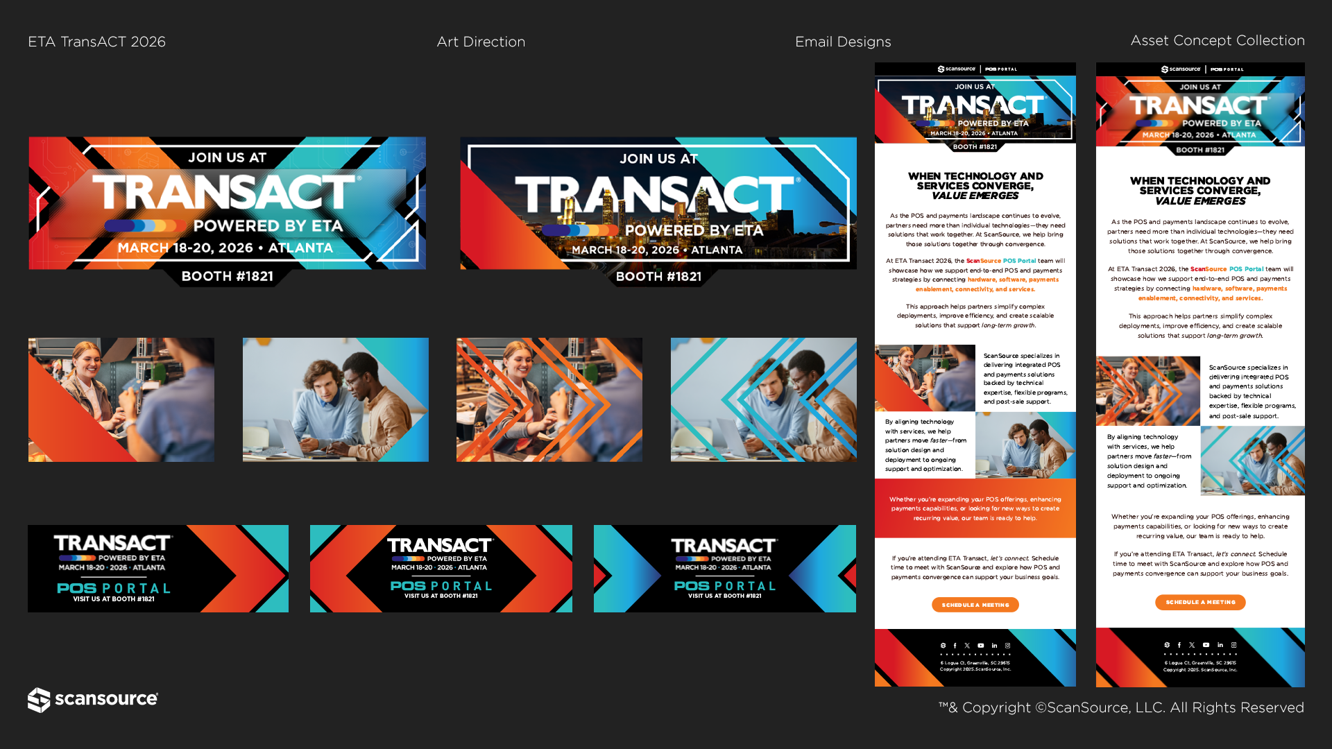
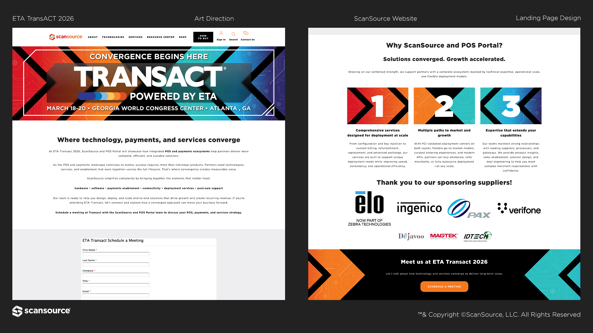
Phase 3: Building Out the Collateral
The booth set the foundation, but the system extended far beyond it. That initial direction became the framework for the full campaign. Email, landing pages, and social were all built off the same visual and conceptual language, then shaped through collaboration with the broader marketing team. Copywriters refined the message, the digital team translated it across platforms, and other designers expanded and adapted the system. What started as a single concept evolved into a unified campaign. Not owned by one person, but carried and strengthened by the team.
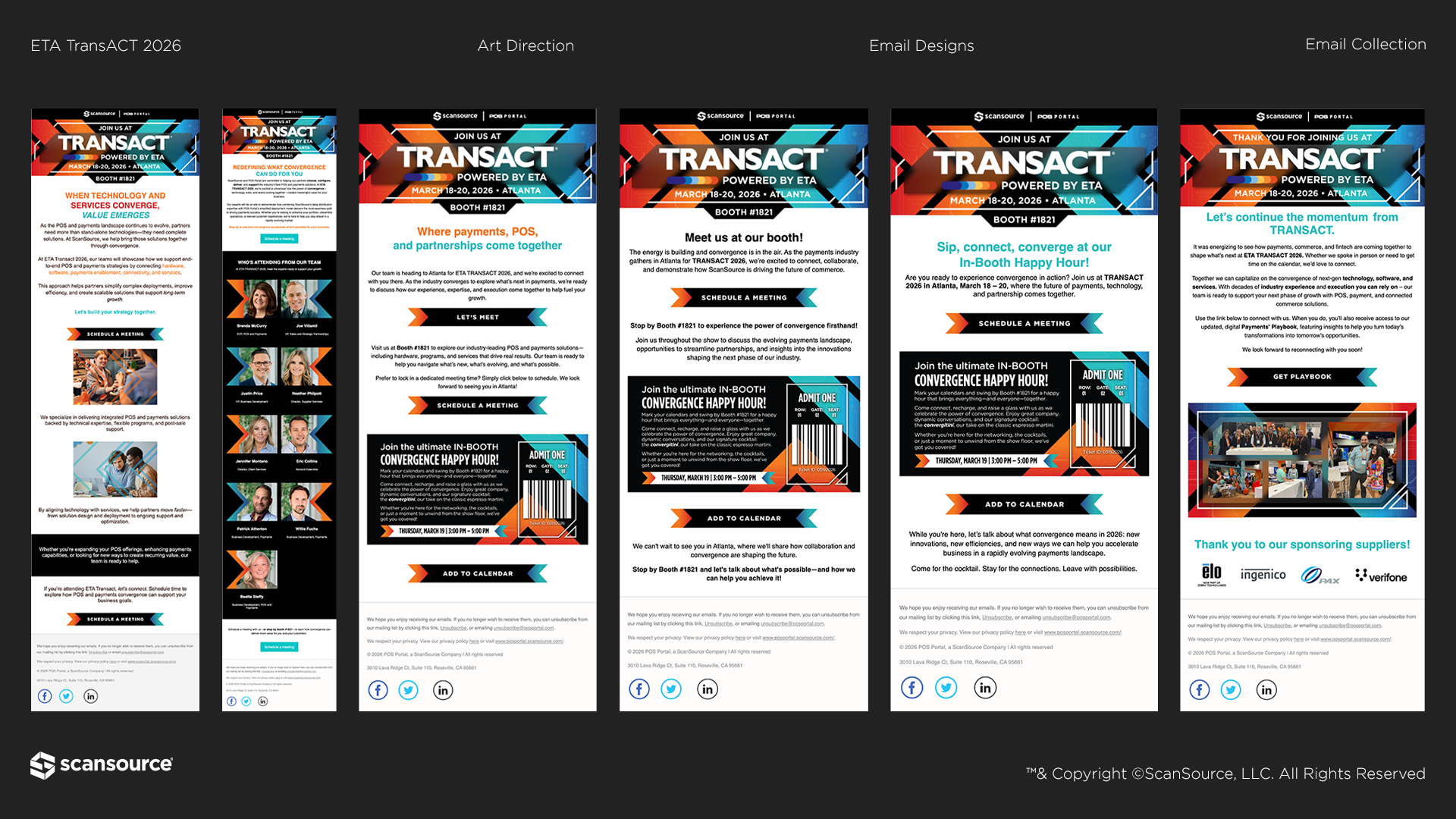
Email Campaign
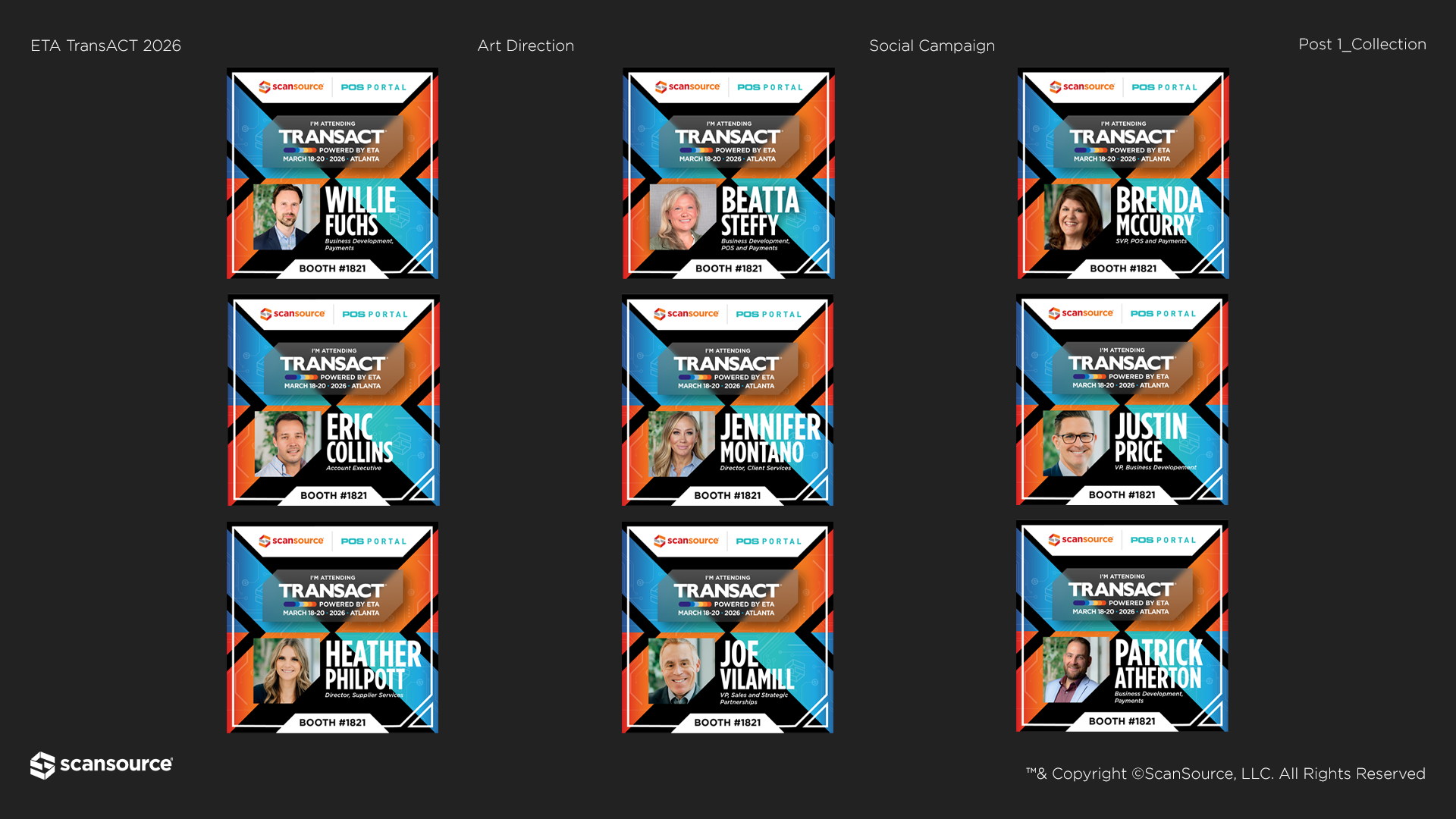
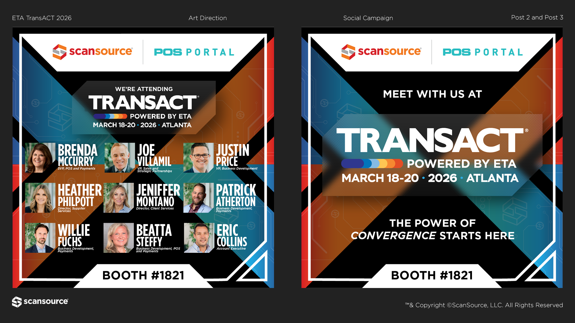
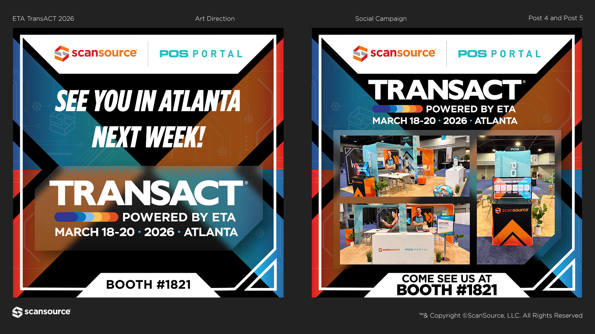
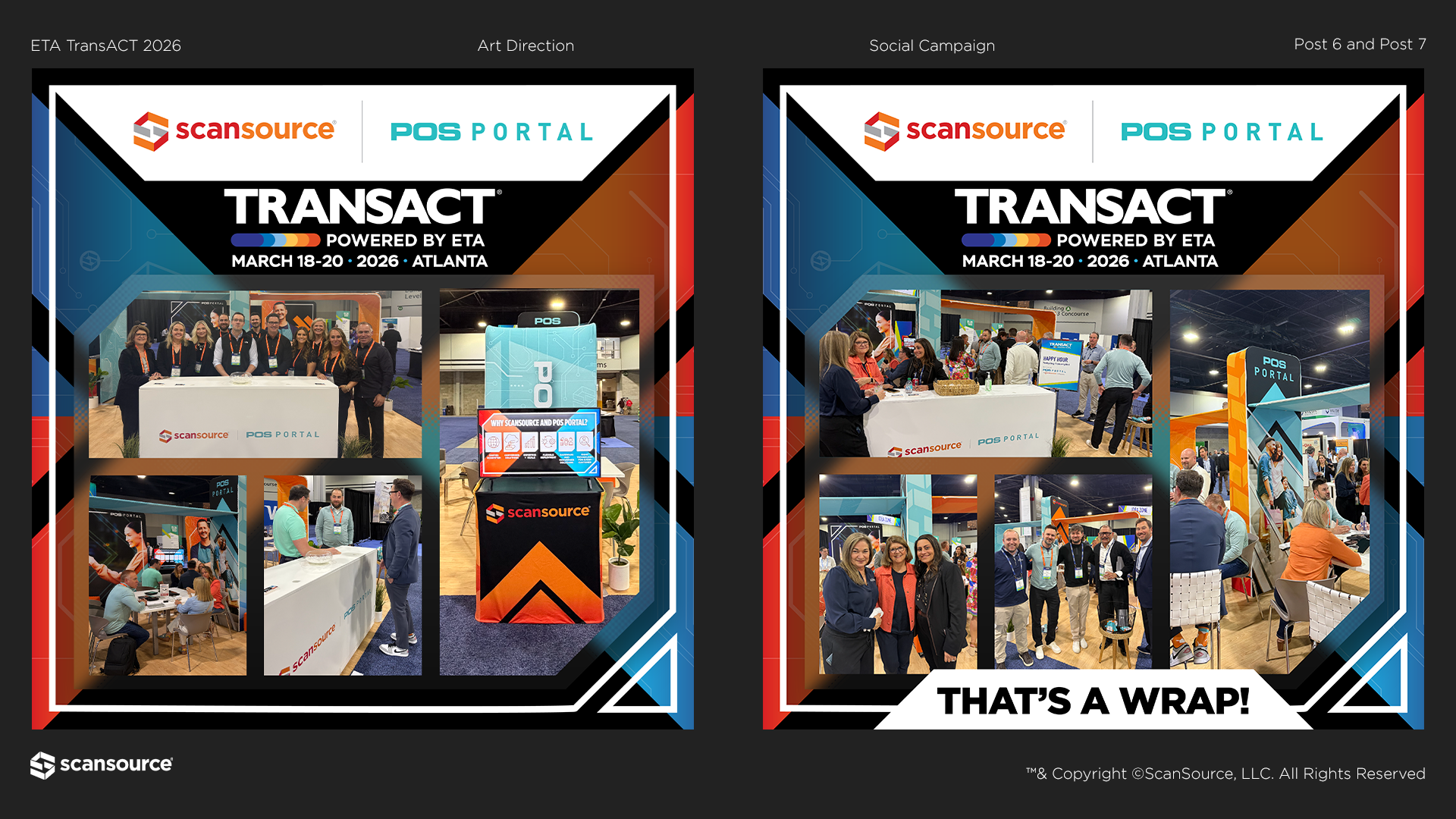
Social Campaign
Landing Page
Looping Slides for the Booth Monitor
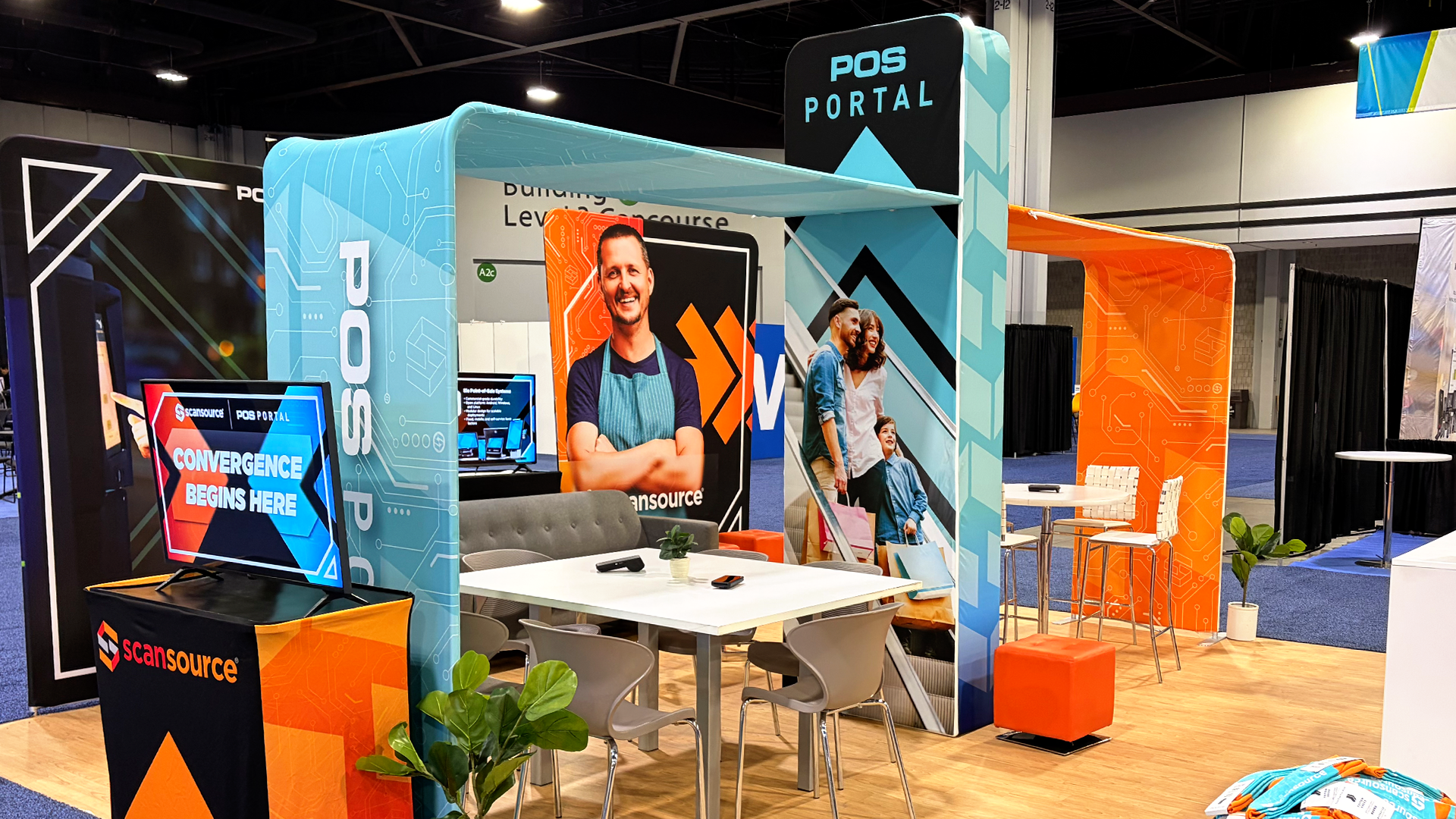
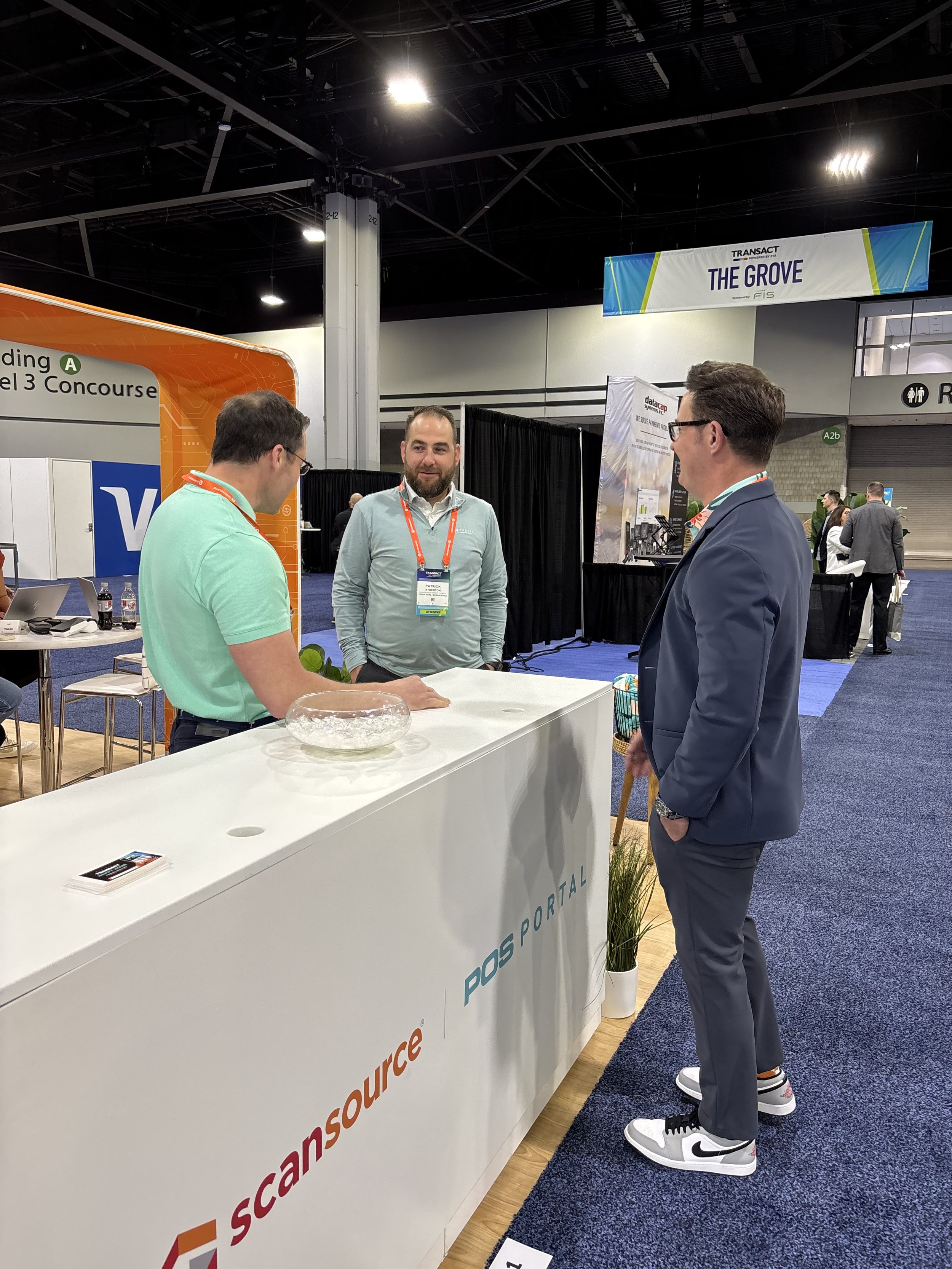
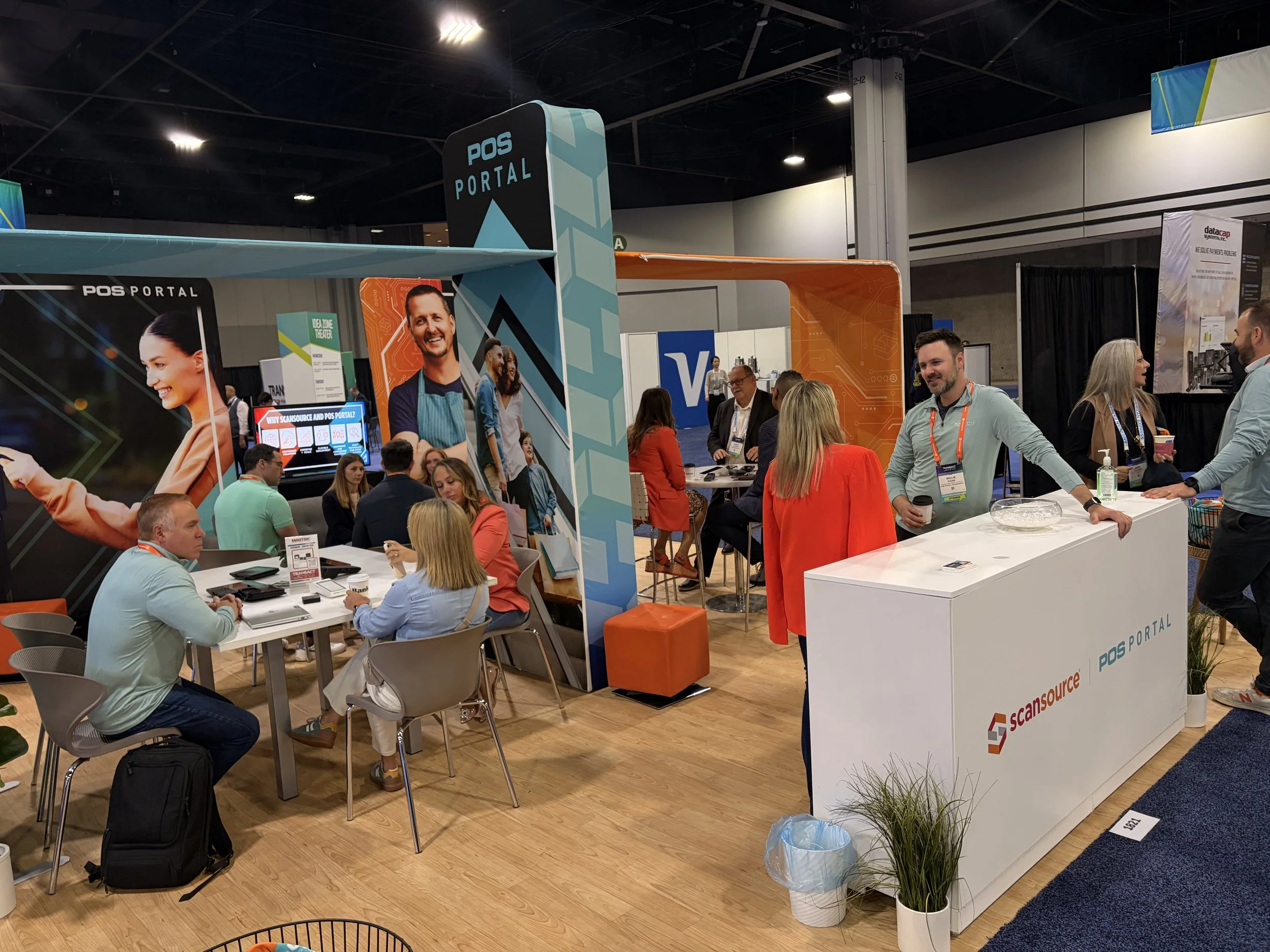
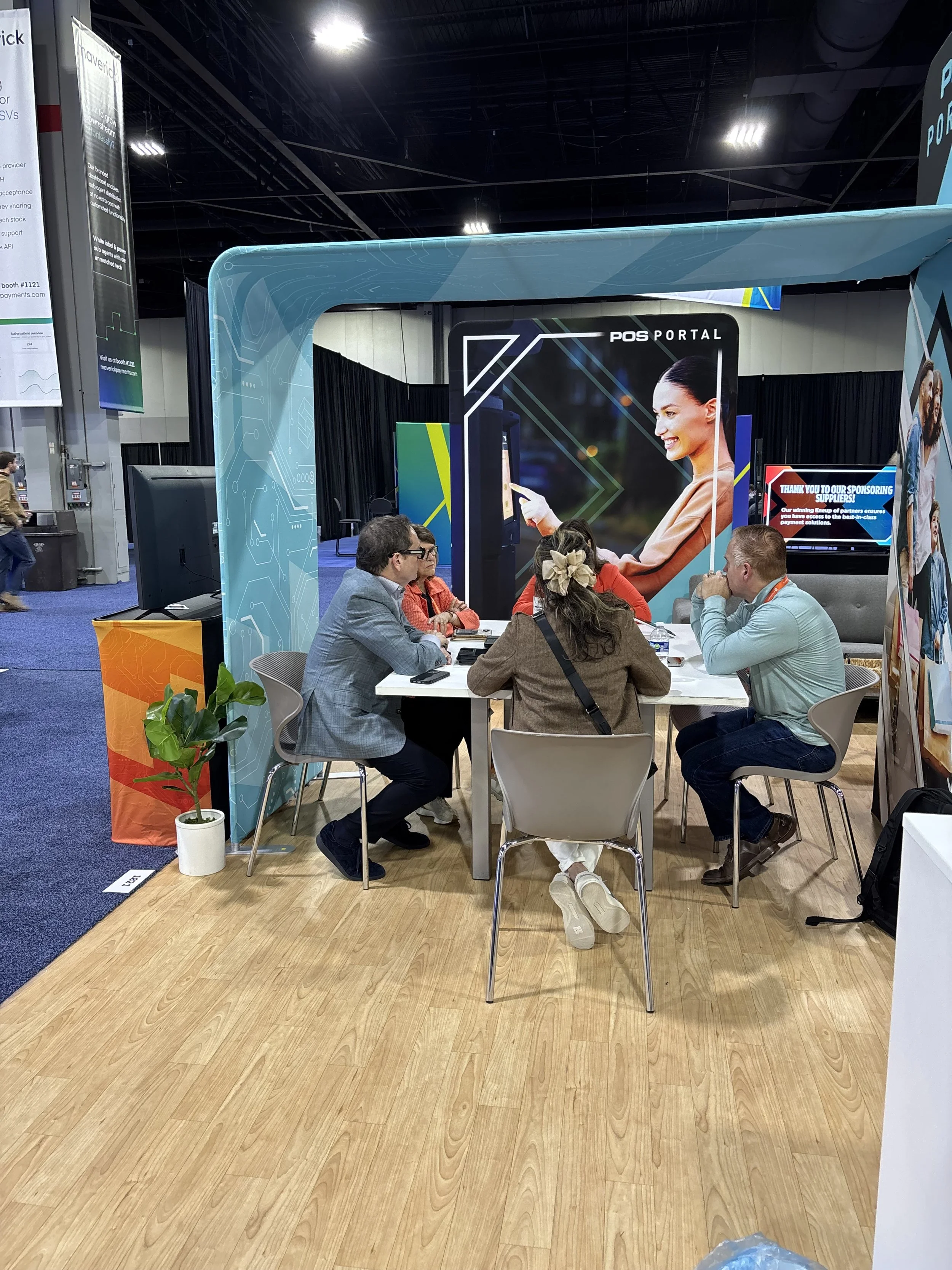
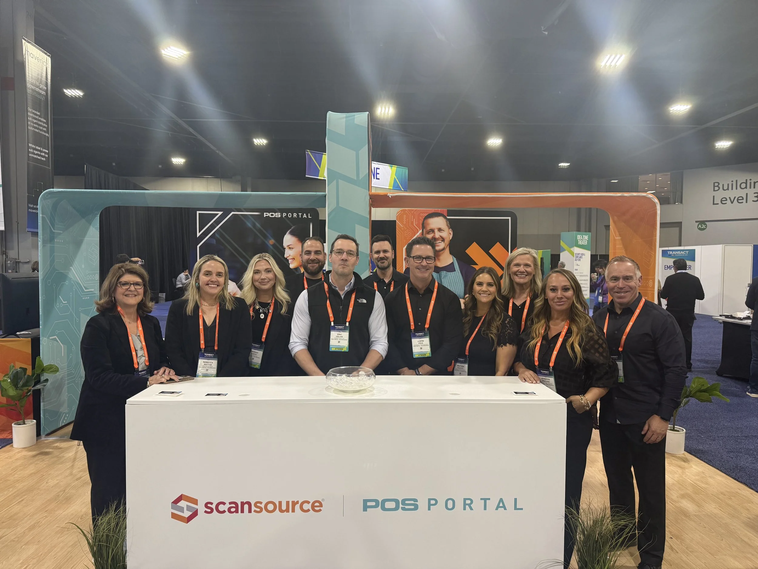
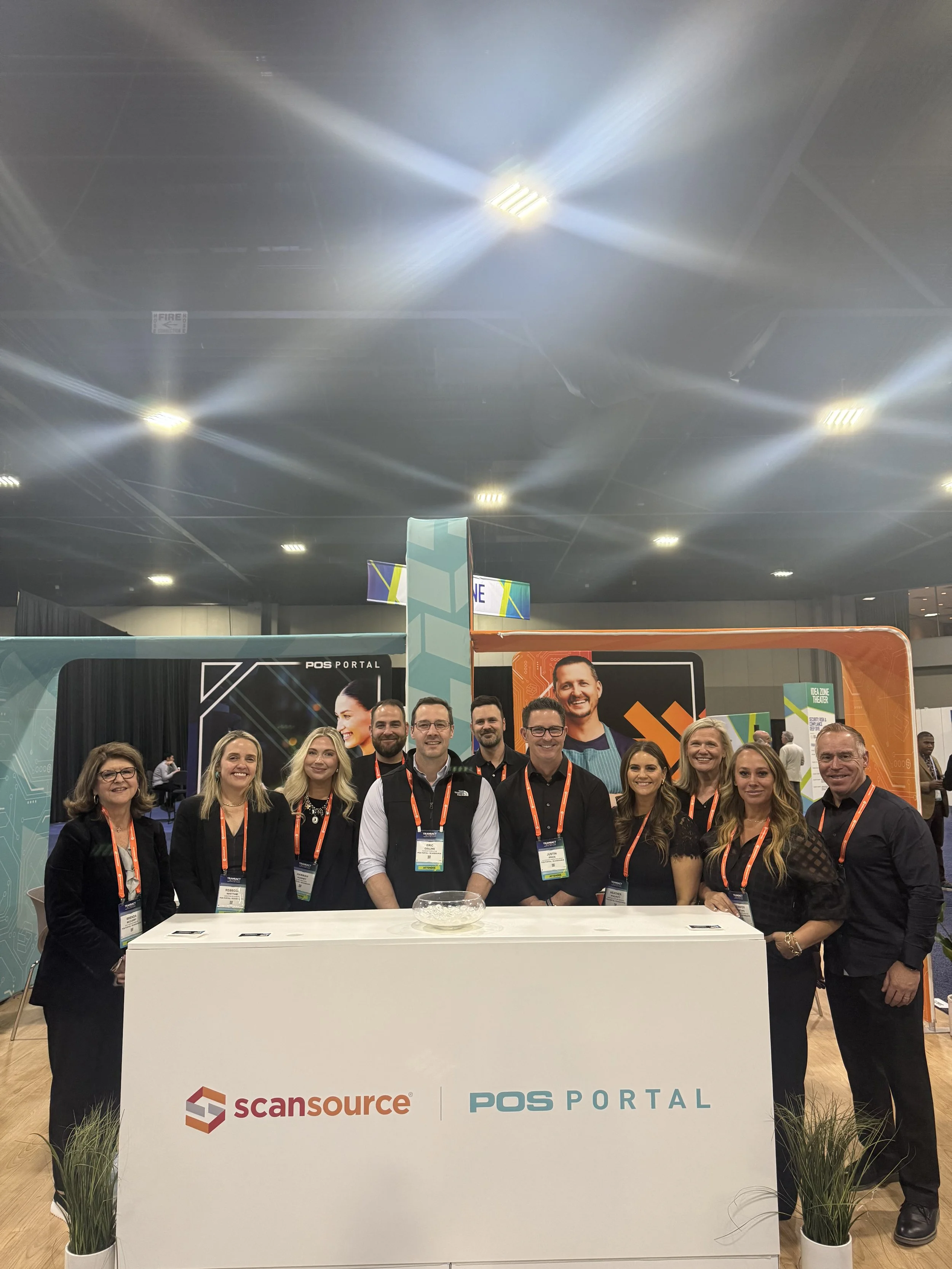
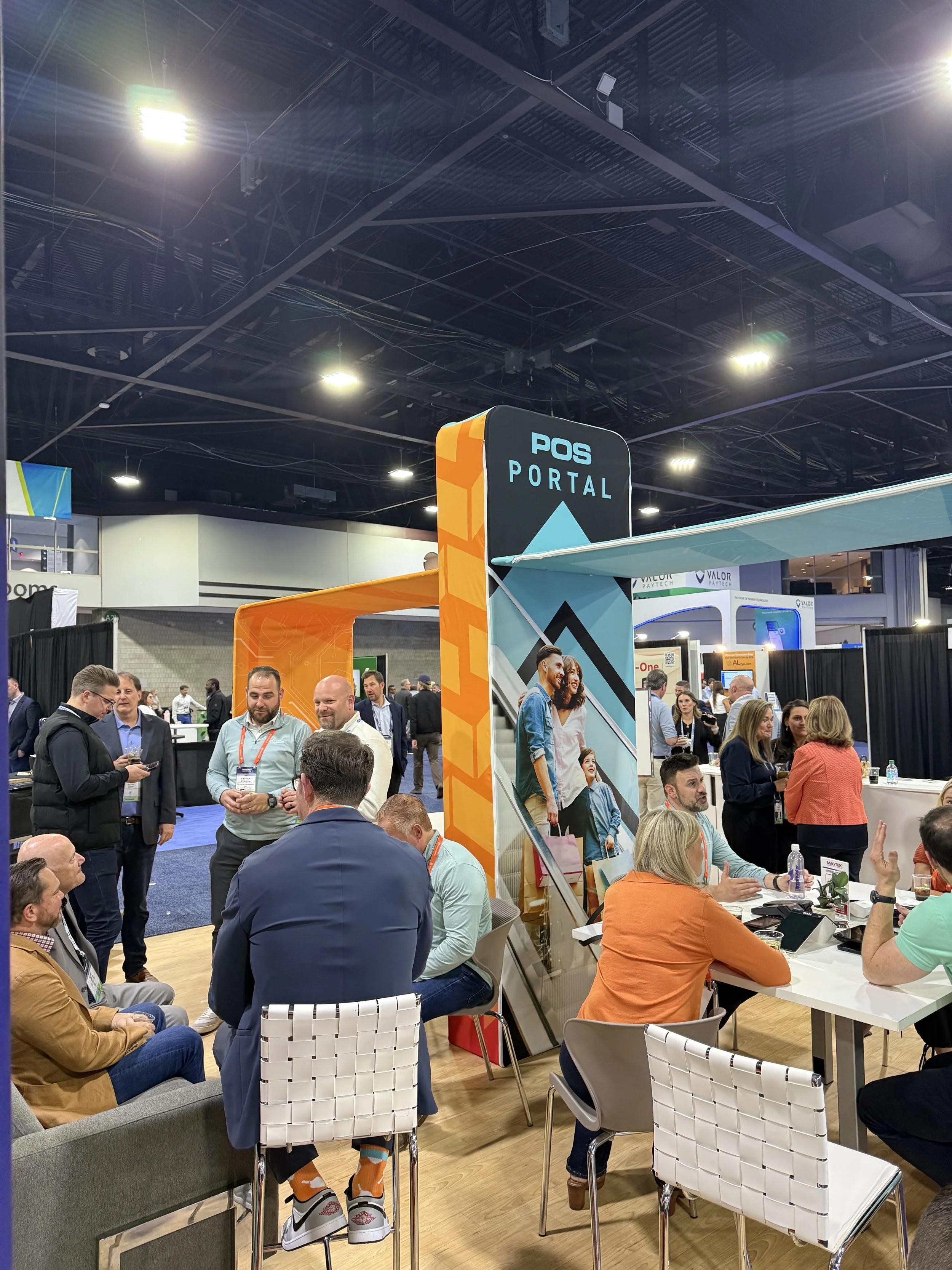
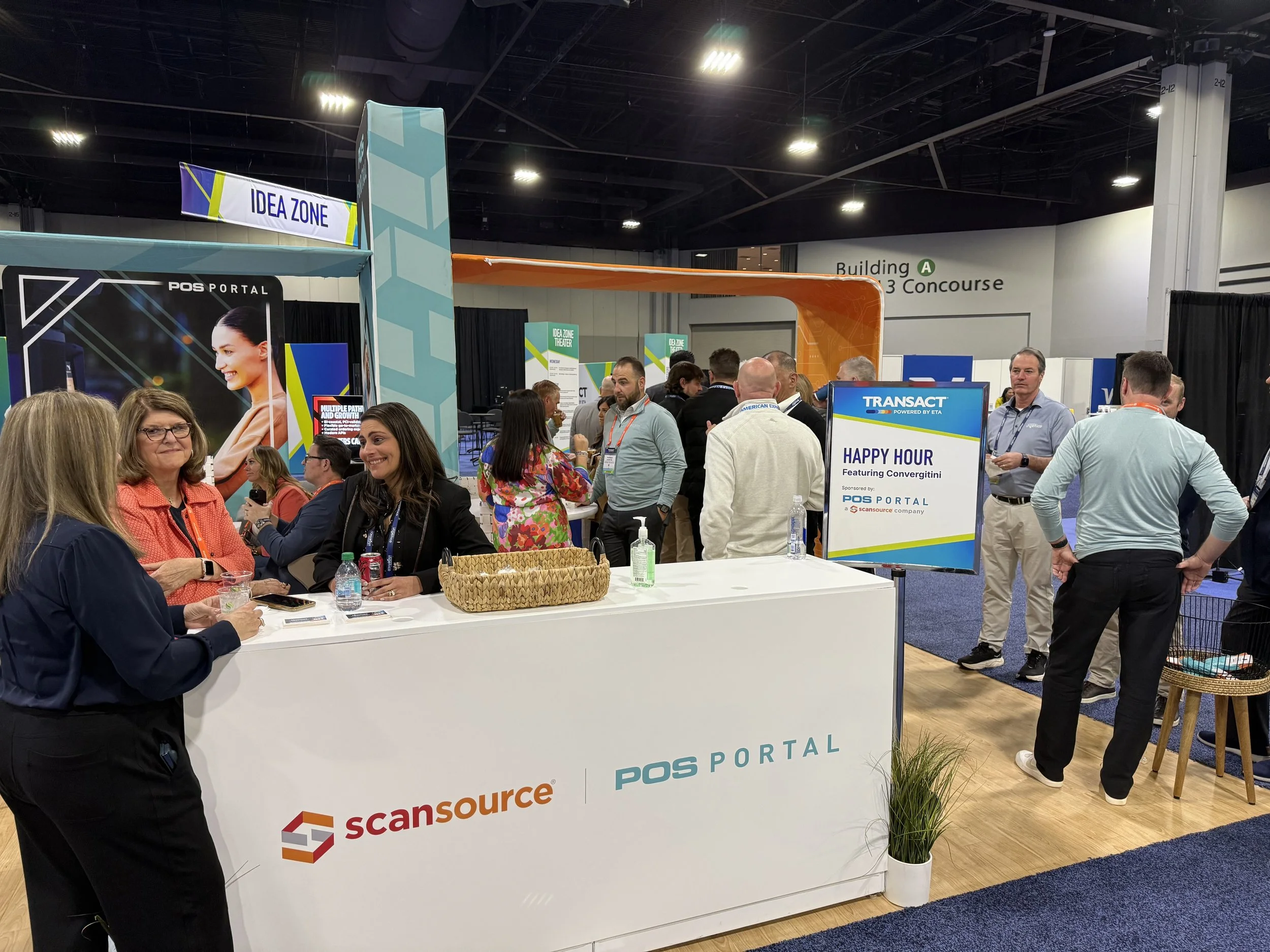
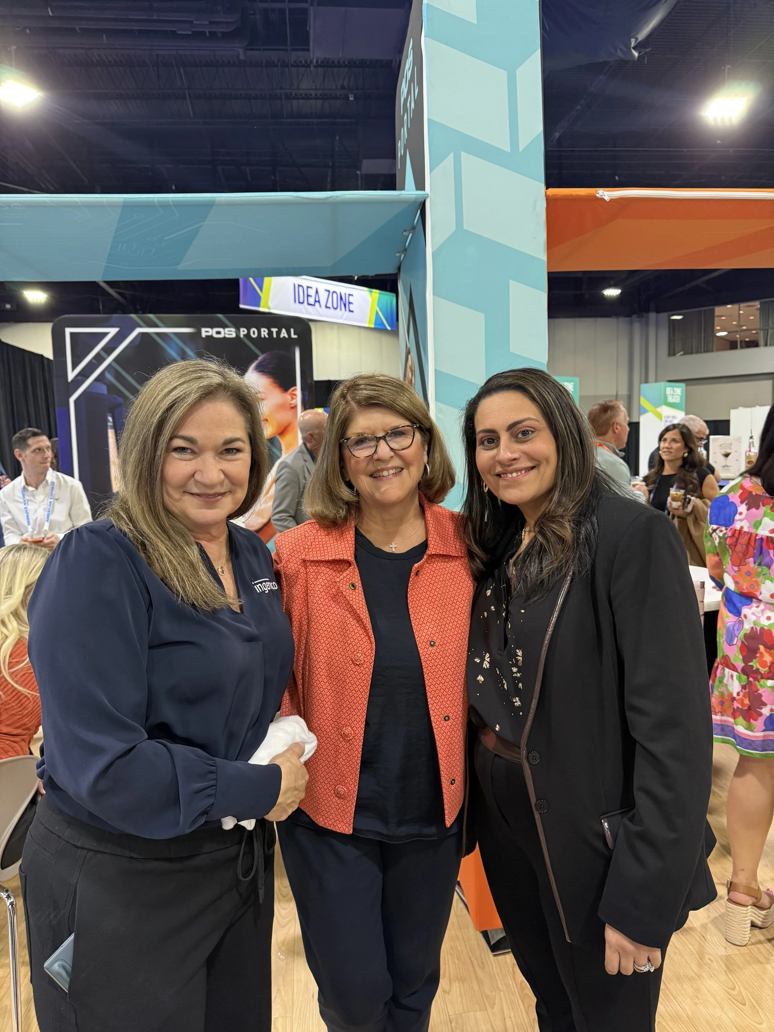
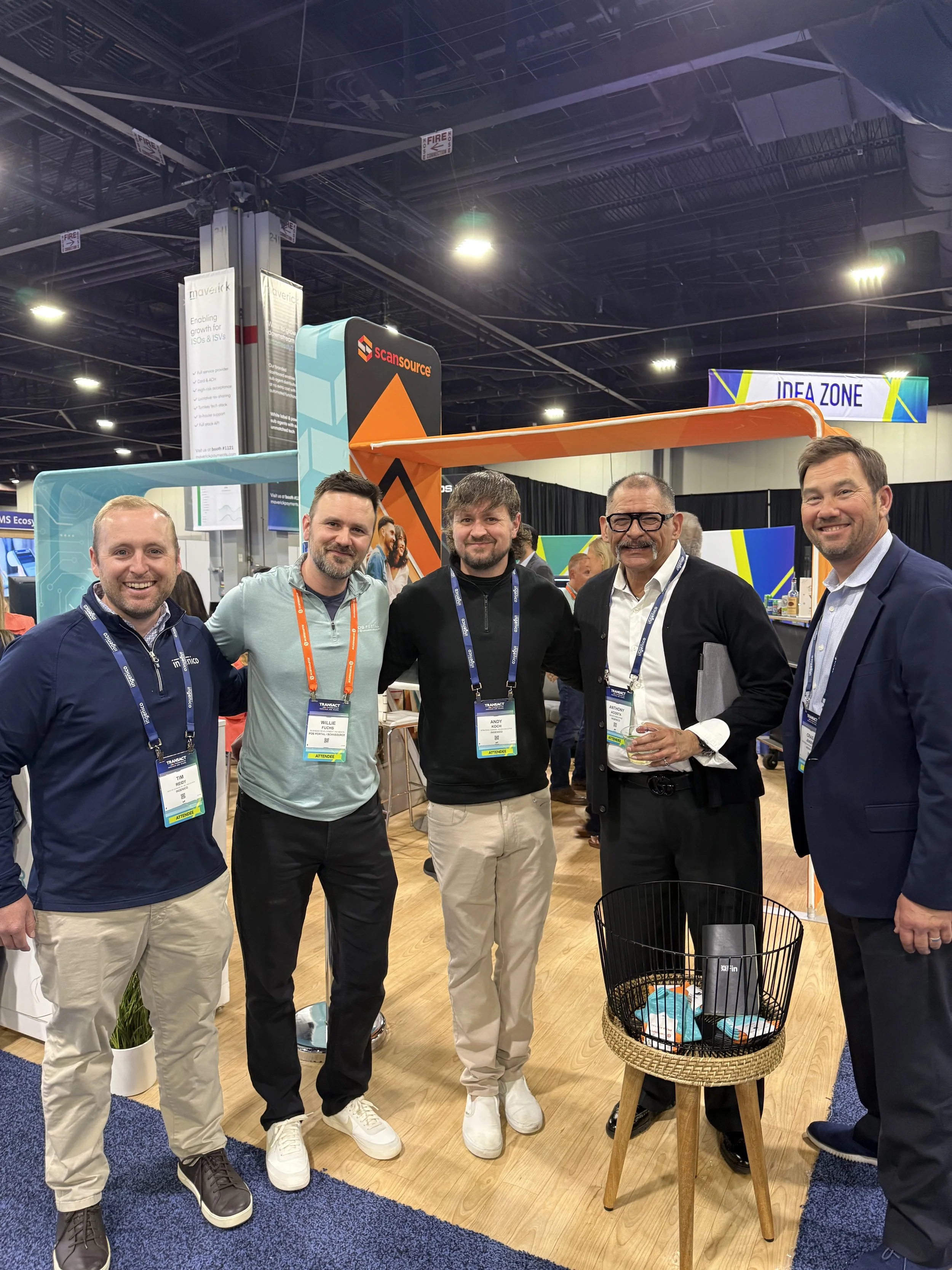
Pictures from the Show
What stood out most about this project was the challenge of bringing diverse viewpoints together around a shared goal. The process became less about executing design and more about orchestrating it. Taking converging ideas, filtering them through business needs, audience expectations, and project goals, then shaping them into something cohesive. The success of the work wasn't measured solely by how it looked, but by how effectively it served everyone involved and solved the problem it was created to address.